Capillary Named a Leader in The Forrester Wave™ Loyalty Platforms, Q4 2025 Report.    Read more >

Capillary: Recognized as a Leader in Everest Group’s PEAK Matrix® 2025    Read more >

Capillary Named a Leader in The Forrester Wave™ Loyalty Platforms, Q4 2025 Report.     Read more >

Invite for RFP/RFI

Blogs

One platform, one experience: rebuilding navigation from the ground up

Every product starts simple. The original navigation was built for the platform as it first existed, and for a long time it fit. Then the platform grew quickly, and the navigation slowly took on complexity it was never designed to carry. That is how we ended up rebuilding it across the whole platform.

By

Capillary Marcom

4 Min Read

July 23, 2026

Why we picked this up

Capillary is a single platform made up of several products: Loyalty+, Engage+, Insights+ and more. On paper that is the whole promise, one platform, one experience. The early navigation reflected how the platform was first positioned, product by product, which made sense at the time but started to strain as more products and modules arrived.

Inconsistent and siloed

Each product grew on its own timeline, so navigation took a slightly different shape in each one, and with the product layer at the top, each product read as its own space rather than part of a single platform.

Discoverability issues

Because we surfaced the product level first, the full range of what the platform could do was not obvious up front; plenty of capable modules sat buried beneath it.

Things drifted out of place

Module-level settings never got a home of their own, so they collected inside product-level settings. Shared modules like Audiences, Creatives and Rewards were reachable through only one product even though several relied on them, and setup-related modules like Event Notifications and Channel Settings did not map to any "+(Plus)" product, so they ended up buried in org settings.

These issues were the byproduct of fast growth, and together it made the platform feel like several apps side by side rather than one coherent product.

What we set out to do

The goal was simple to state: make the whole platform feel like one product, and make everything it can do visible and reachable. As the platform grew, menus had nested several layers deep, which was a big part of why modules were harder to find. So we capped the nav at two levels. That forced us to be deliberate about grouping and pushed anything deeper into the pages themselves, rather than solving visibility by nesting menus even further.

How we grouped it

We restricted the navigation panel to two levels to reduce crowding and cognitive load, which meant the grouping itself had to do the heavy lifting. Rather than sort modules alphabetically or by product, we ordered the rail by how people work and who each part is for.

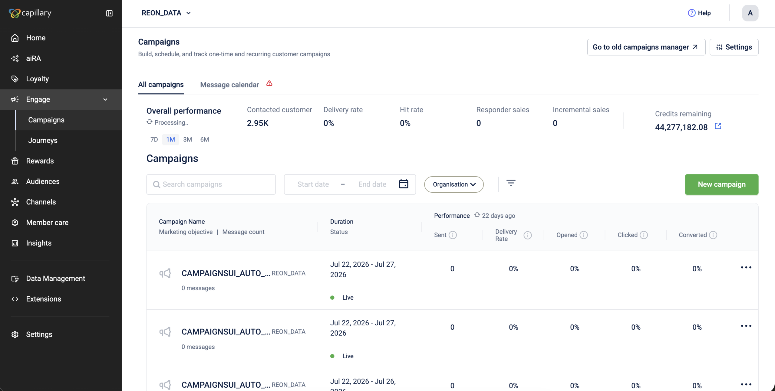
At the top are the orchestrators, aiRA, Loyalty, Engage and Experiences, where the day-to-day work of running programs happens. Under those sit the building blocks they consume, Rewards, Audiences and Creatives, shared pieces that feed more than one orchestrator, which is why they now sit on their own rather than inside a single product. Below that are the areas built for specific people: Member Care for support agents, Insights for measuring performance, Data Management for data configuration, and Extensions for developers. Grouping this way means you find what you need by asking "what am I trying to do?" rather than "which product was this under again?"

Getting everyone in the room

You cannot regroup a platform's information architecture in a vacuum. Moving or renaming a module has ripple effects nobody notices until it ships. So before touching a single design, we ran alignment sessions across Product, Engineering, Sales and Customer Success. Sales and CS were especially valuable: they hear where customers get lost, and that shaped decisions pure product logic would have missed. We also spoke to a few customers directly, and how they described modules in their own words validated some groupings and corrected others. By the time we had designs, the groupings were a shared decision, not a surprise.

Testing it with real users

Alignment tells you a grouping makes sense to us. User testing tells you whether it makes sense to the people who live in the product. We tested the groupings and the nav interactions to finalise the designs.

The expand and collapse behaviour was the clearest example. What tested most naturally was a rail that stays collapsed until you click the expand icon, and collapses the same way. The one exception is drilling into modules: when an L1 item has L2 modules under it, clicking it expands the rail to show those items, and once you pick one the rail collapses on its own. That rule, expand to choose then get out of the way, was the model most users reached for without being told.

Testing also pushed us to standardise every module's landing page: a clear sub-module header, a fixed home for settings, and an L3, L4 tab structure for the deeper levels. Because the nav stopped at two levels, those tabs became the way to go deeper, and every module now opens into a consistent page.

The single-app problem, and the MFE answer

Because each product had been built somewhat independently, switching between them could rebuild the entire left navigation, a reminder that these had started life as separate apps under one roof. We wanted a left nav that stays put as you move across products.

The solution our Engineering team proposed was a Micro Front End (MFE), a shared component that renders all the modules inside it. With every module living in that single shell, switching products no longer rebuilds the nav. It persists, the frame stays stable, and the experience finally matches the promise.

Before and after

The clearest way to see the shift is to follow a single task, getting to internal modules. In the old navigation, you opened a product picker, chose the right product, then hunted for your module in that product's own top bar, even for modules used everywhere. Now every module is one click away.

BEFORE

AFTER

What we learned

The neat lesson would be "navigation is more than a menu," and that is true. The harder part was the thinking underneath it: how modules should be grouped, where settings belong, and which pieces are shared rather than owned by one product. Those calls held up because we made them with the teams closest to customers and tested them with the people who use the product.

The payoff is a platform that finally behaves like one. Everything is visible up front, settings live where you would expect, shared modules belong to everyone, and moving between products no longer feels like leaving one app for another. One platform, one experience, this time in the product and not only on the slide.

See what's changed

Walk through the new navigation, the new groupings, and where modules moved, in the navigation documentation.

CapillaryTech Logo
Capillary Marcom

Capillary Technologies is an AI-powered loyalty platform for enterprise brands. Capillary Marcom is the official handle for Capillary's marketing and communications team. Write to marcomm@capillarytech.com for more information.

Capillary Technologies is an AI-powered loyalty platform for enterprise brands. Capillary Marcom is the official handle for Capillary's marketing and communications team. Write to marcomm@capillarytech.com for more information.

Contact Us

Get the best loyalty &
customer engagement platform out there!
  • Design industry shaping loyalty programs
  • Integrate easily and go live quicker
  • Deliver hyper-personalized consumer experiences

Request A Call
Array
(
    [wp-wpml_current_language] => en
    [icwp-wpsf-notbot] => notbotZaltchaZexp-1784805933
)