8 Looker Alternatives That Don’t Require LookML

Marketing teams need timely answers to questions such as which loyalty members are most likely to lapse before the holiday season. In Looker, a question of this kind typically remains in the data team’s queue until an engineer has modeled the relevant data in LookML. By the time the answer is available, the window for acting on it may already have passed.

Even once the answer arrives, it represents only the first step in the process. Marketing teams must still define the target audience, select the appropriate offer and launch the campaign, and Looker does not support any of these stages.

This guide compares eight Looker alternatives so you can choose one for your team. Let’s begin.

Tl;dr 

We evaluated each tool on how quickly business users can get answers without a data model, how well it handles customer and campaign data, whether it supports action on insights, and how long it takes to deliver value. These are the eight Looker alternatives worth considering in 2026:

  1. aiRA by Capillary: Best overall Looker alternative for marketing, CRM and loyalty teams.
  2. Domo: Best for connectors, data preparation and dashboards in one cloud platform.
  3. Metabase: Best for affordable, open-source BI that non-technical users can query.
  4. Hex: Best for SQL and Python analysis shared as interactive data apps.
  5. Sigma: Best for spreadsheet-style analysis on live cloud warehouse data.
  6. Power BI: Best for reporting within the Microsoft 365 ecosystem.
  7. ThoughtSpot: Best for natural language search on a modeled cloud warehouse.
  8. Tableau: Best for custom visual dashboards built by analyst teams.

What is Looker?

Looker is Google Cloud’s enterprise business intelligence (BI) platform. Data teams use LookML, its modeling language, to define metrics, joins, and business logic once, so every dashboard works from the same definitions. 

It’s sold in three editions: Standard and Enterprise for internal BI, and Embed for building analytics into your own products. None of the editions has a published list price, and all require an annual commitment. 

In 2026, Google repackaged its Looker product family. It renamed its free reporting tool, Looker Studio, to Data Studio, removed Looker’s list prices from its pricing page, and began billing Conversational Analytics usage beyond an included allowance from October 1, 2026.

Where does Looker fall short? 

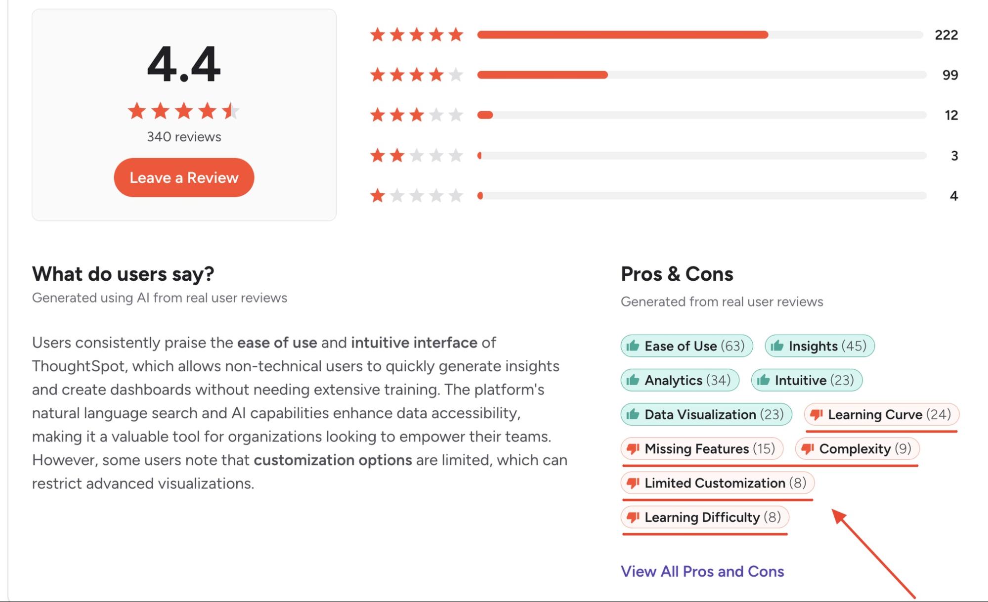
Looker holds a 4.4-star rating on G2 across 1,652 reviews. Users rate it highly for ease of use once it is configured (108 mentions) and for real-time reporting (64 mentions). For organizations that need a single, governed definition of every metric, it remains a strong choice.

However, G2 and Capterra reviews point to several recurring limitations:

  • Dependence on LookML (52 mentions for learning curve, 38 for learning difficulty): Business users cannot explore data until engineers have modeled it in LookML. As one G2 reviewer noted, “A dedicated developer needs to set up the data models first.”
  • Performance at scale (29 mentions each for slow loading and slow performance): Response times decline on large datasets and complex queries.
  • Limited visualization options (22 mentions for limited customization, 20 for poor visualization): Reviewers report that some standard chart types require workarounds.
  • Pricing transparency: Google offers Looker in three editions (Standard, Enterprise and Embed), all of which are priced by quote and require an annual commitment. In 2026, Google removed the previous list prices from its pricing page. From October 1, 2026, AI usage beyond the included allowance is billed separately.
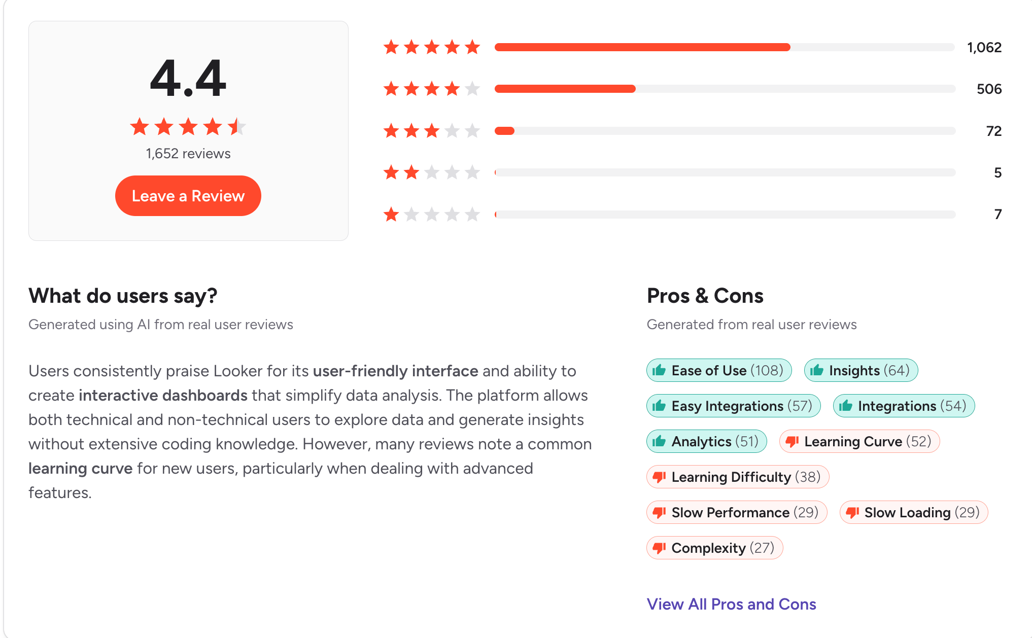
Image shows customer reviews and ratings of Looker on G2 as well as an option to see Looker alternatives like aiRA by Capillary

Looker is best suited to organizations with dedicated data engineering resources. For marketing and CRM teams that need timely answers about customers and campaigns, the modeling requirement often delays results.

The alternatives below address these limitations in different ways.

How this list was tested and selected

A good Looker alternative should let someone outside the data team ask a question and trust the answer. 

It shouldn’t need engineers to write a semantic model before it’s useful. It should stay fast as your customer data grows, and the price shouldn’t be a surprise at renewal.

So we took the complaints that come up most often in Looker’s G2 and Capterra reviews and turned each one into a criterion. Here are the questions we asked when building this list:

  • Learning curve: Can a business user get a useful answer in their first week, without learning a modeling language?
  • Setup: How long does it take to go from kickoff to working on your own brand data?
  • Performance: Does it stay fast on large customer datasets and complex queries?
  • Visualization and customization: Can you shape reports around your team’s needs without workarounds?
  • Pricing: Is pricing clear upfront, and does it stay predictable as users and data grow?

Best Looker alternatives at a glance

Tool nameBest forStandout featureG2 ratingLimitation
aiRA by CapillaryMarketing, CRM and loyalty teamsTakes a plain-English customer question through to a campaign ready for launch4.7/5Built for marketing and CRM use cases, not company-wide BI
DomoConnectors, data prep and dashboards in one platformPrebuilt connectors with drag-and-drop Magic ETL4.3/5Credit-based pricing is costly and requires ongoing monitoring
MetabaseAffordable, open-source self-service BIVisual query builder that requires no SQL4.4/5Performance and visualization options are limited on large datasets
HexSQL and Python analysis shared as data appsSQL and Python notebooks in one project4.5/5Slow load times and limited sharing permissions
SigmaSpreadsheet-style analysis on live warehouse dataSpreadsheet-like workbooks on live warehouse data4.4/5Slows down with large workbooks and datasets
Power BIReporting within Microsoft 365Native integration with Excel, Teams and SharePoint4.5/5DAX formulas and data modeling are difficult for beginners
ThoughtSpotNatural language search on modeled warehouse dataSpotter AI agent for plain-English questions4.4/5Steep learning curve and a data team must model the warehouse first
TableauAnalyst teams building custom visual dashboardsDrag-and-drop visual analysis4.4/5Advanced features are complex, and licensing costs rise with more users


Top 8 Looker alternatives to choose from

1. aiRA by Capillary 
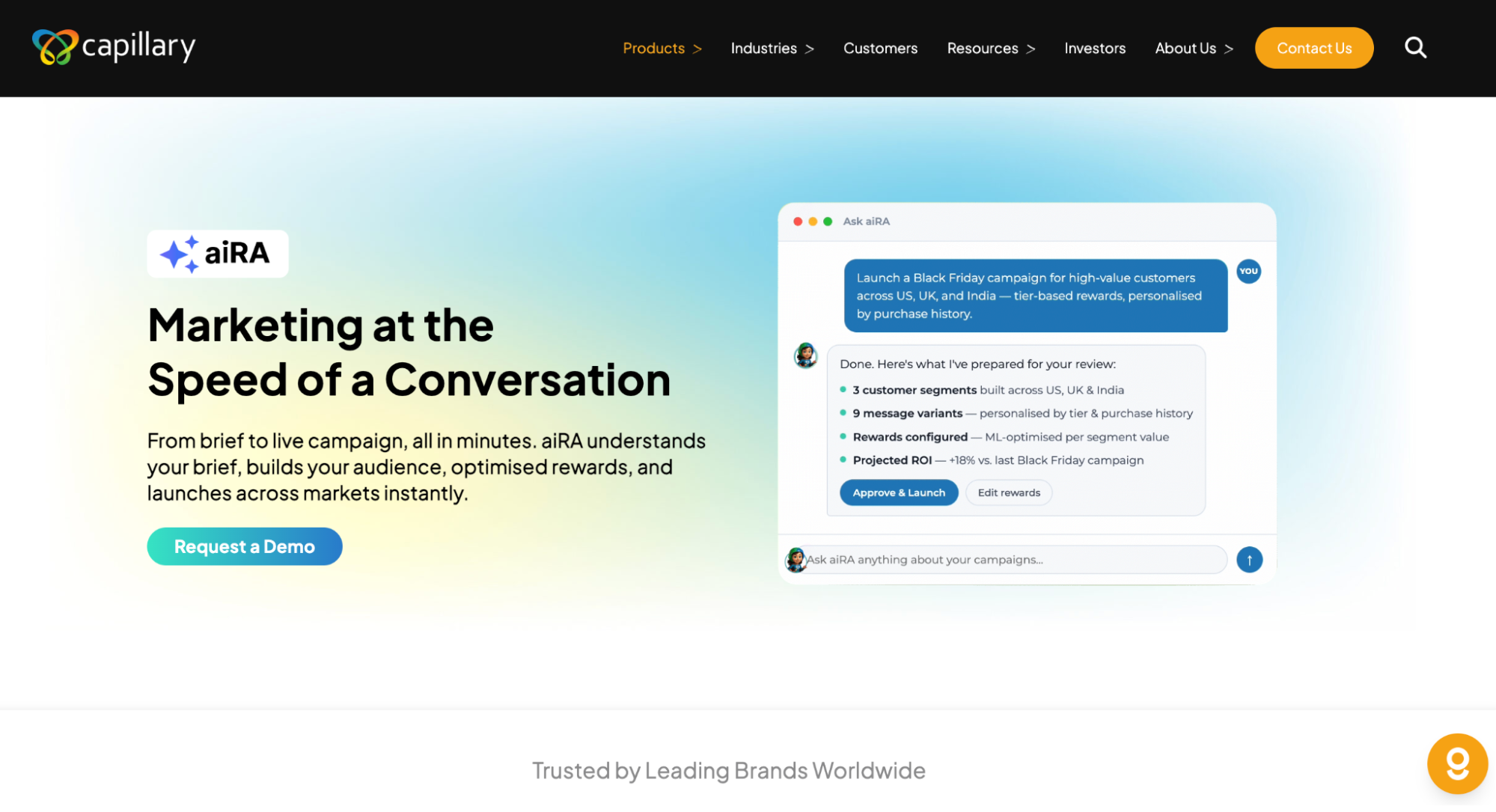
Screenshot of aiRA by Capillary webpage. aiRA by Capillary is an analytics agent.

Best for: Enterprise marketing, CRM and loyalty teams that need answers about customers and campaigns without waiting for a data model to be built.

aiRA by Capillary is an AI agent built for enterprise marketing and loyalty teams. In Looker, every new question depends on engineers first modeling the data in LookML. aiRA works directly on your brand’s customer data, so teams can ask questions in plain English and get answers on their first day.

Once aiRA identifies an opportunity, it recommends the audience, offer, reward, message and channel, and it can set up the campaign for your team to review and approve. It can also create Jira tickets, send Slack notifications or trigger workflows in other applications.

A full deployment on your brand data typically takes 2–4 weeks from the first conversation, with a dedicated Capillary success manager supporting your team throughout.

Key features

  • Plain-English customer analytics: Profile customers and identify trends such as seasonal buying patterns and engagement shifts, without SQL or a semantic model.
  • Self-serve segmentation: Describe an audience and aiRA builds the segment, complete with propensity scores and projected campaign value.
  • Campaign creation and recommendations: Configure the audience, rewards, messaging and multi-channel delivery from a single brief. Each recommendation comes with a predicted ROI by market and an explanation of the reasoning.
  • Enterprise governance: aiRA is ISO 27001 aligned and compliant with PCI DSS, GDPR, CCPA and PDPA.

Pros

  • Marketing and CRM teams can access customer insights and segments directly, without analyst requests or engineering support
  • Analysis, segmentation, campaign setup and measurement all happen in one conversational workflow
  • Human approval on every customer-facing action and a full audit trail meet enterprise governance requirements

Cons

  • Designed for enterprise marketing, CRM and loyalty use cases, so aiRA may not be the best fit for startups

See aiRA on your own data

Request a demo to see how aiRA turns a question about your customers into a campaign ready to launch, with no LookML required.

2. Domo
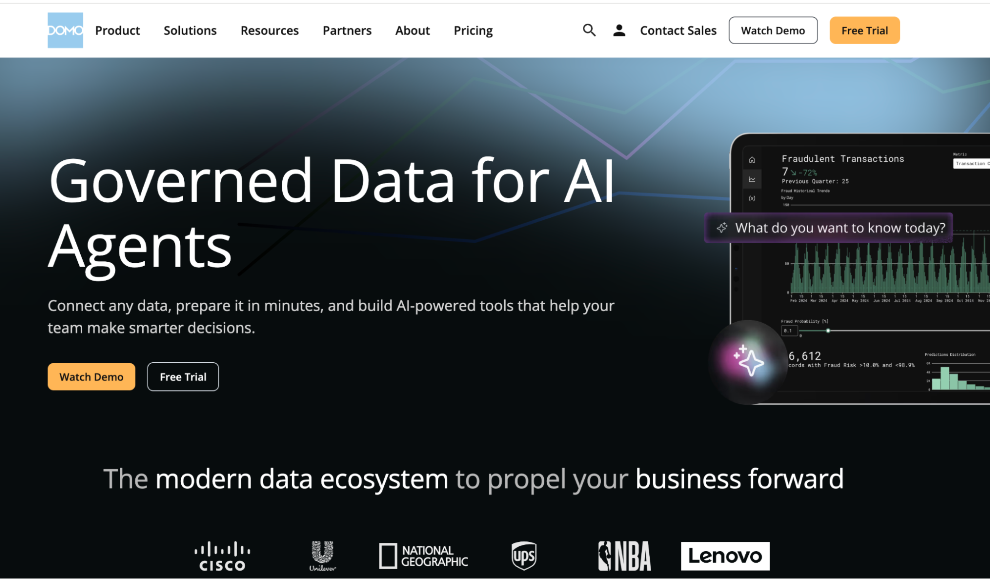
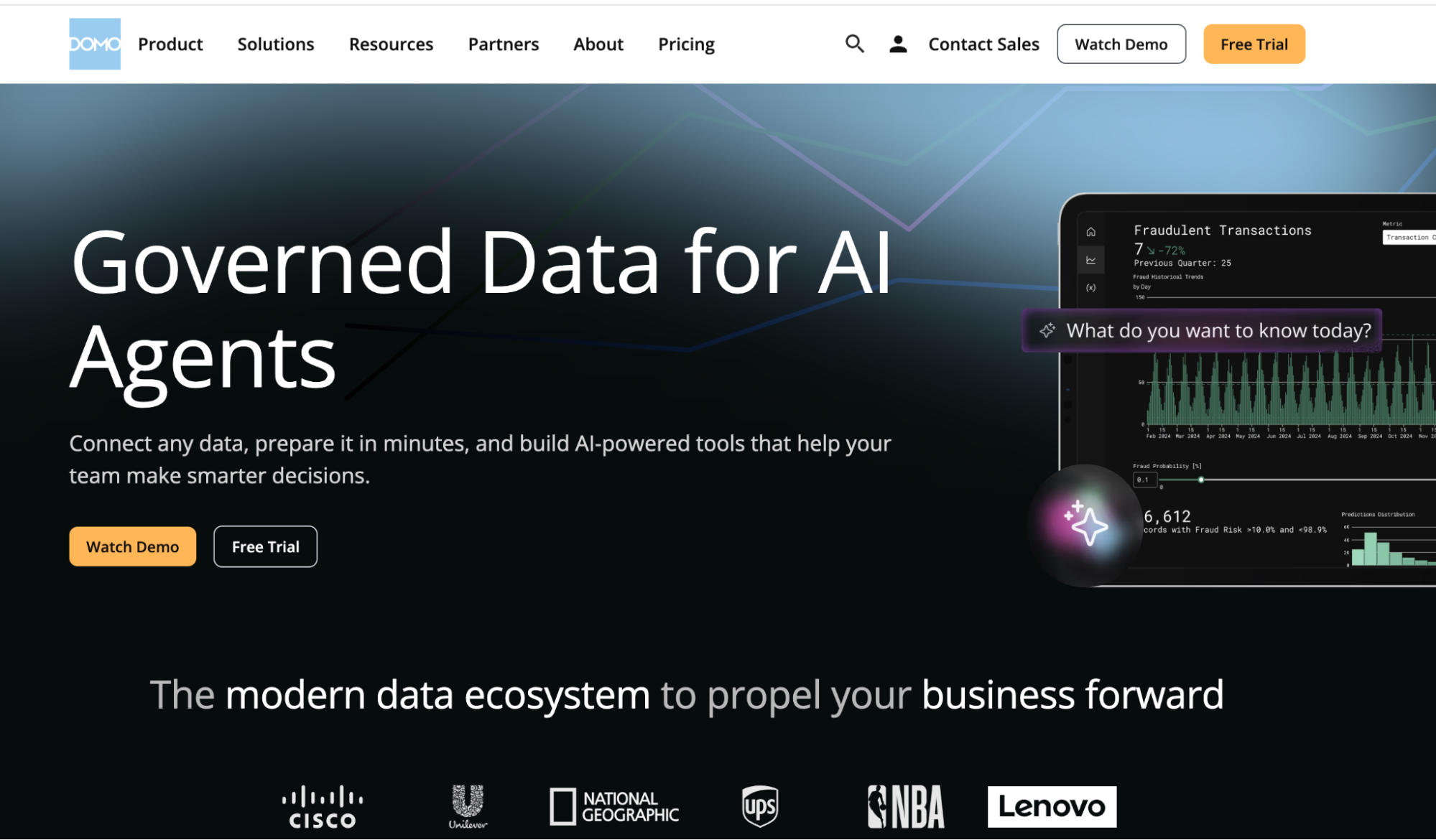
Screenshot of Domo webpage

Best for: Mid-size and large companies that want connectors, data prep, and dashboards in one cloud platform, without modeling data in code first.

Domo is a cloud BI platform, now part of Progress Software, that combines data connectors, transformation, dashboards, and apps in one place. Unlike Looker, it doesn’t need a semantic layer written in code before people can start building reports. Teams blend data with a drag-and-drop ETL tool instead. 

It works best when a BI team sets up the pipelines and dashboards that business teams then use. Advanced features still take time to learn, and credit-based pricing can climb as data volume and usage grow.

Key features

  • Prebuilt connectors: Pull data from CRMs, ERPs, ad platforms, cloud warehouses, and spreadsheets into one place without building custom API connections.
  • Magic ETL: Clean, join, and transform datasets with a drag-and-drop pipeline builder, or switch to SQL for more complex logic.
  • Dashboards and App Studio: Build cards and dashboards, then package them into custom apps for different teams.
  • Alerts and mobile access: Set thresholds on KPIs, get notified when a metric shifts, and check live dashboards from the mobile app.

Pros

  • Quick to get started, with enough prebuilt connectors to link most sources without a custom API connection 
  • Brings campaign data from multiple ad platforms into one place, which makes client reporting easier 
  • Pulls data from different tools into live dashboards without needing technical skills 

Cons

  • The cost is high, and teams have to keep track of their credit usage 

3. Metabase
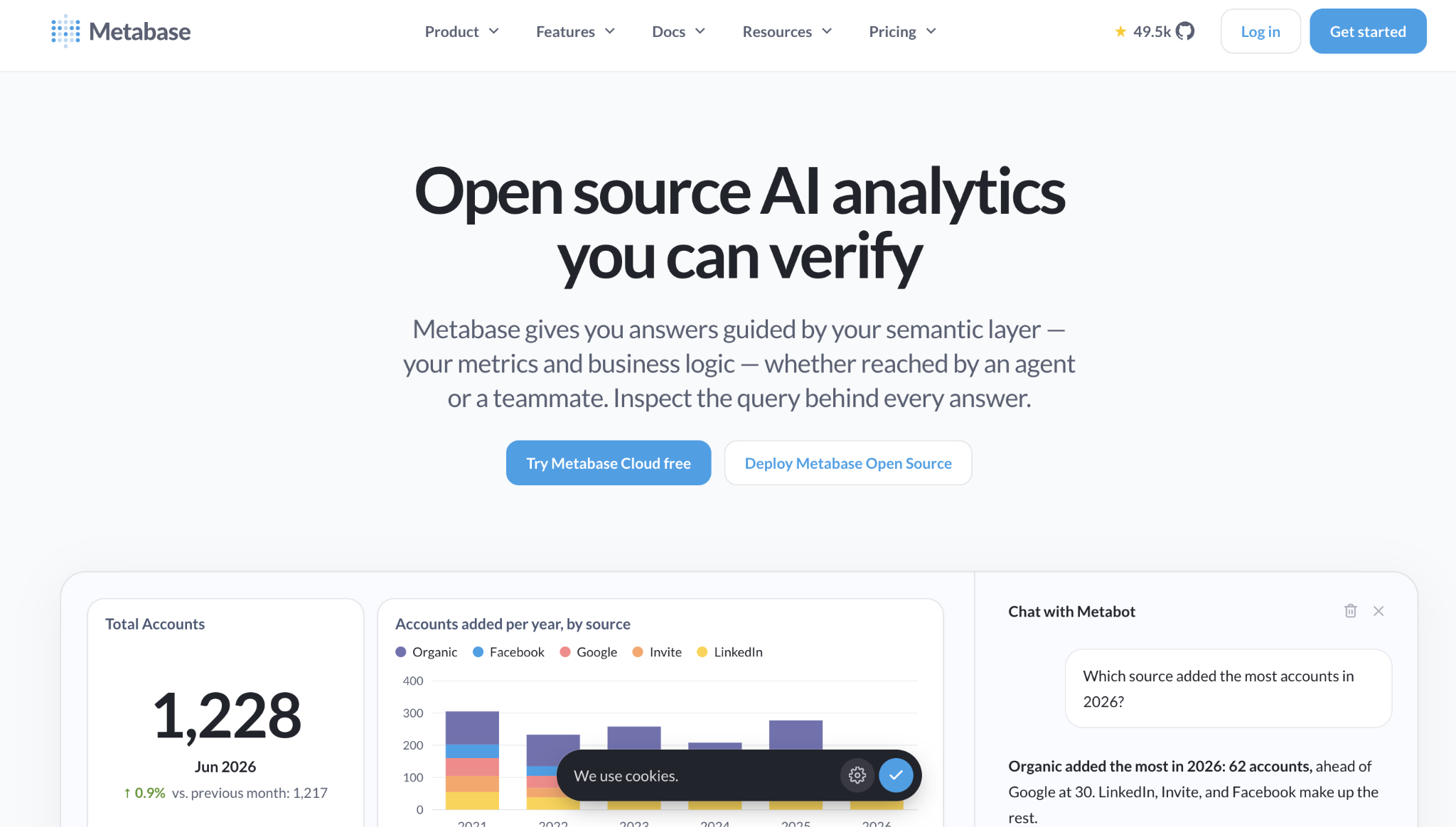
Screenshot of Metabase webpage

Best for: Startups and mid-size teams that want affordable, open-source BI that business users can query without writing SQL.

Metabase is an open-source BI tool that you can self-host for free or run on Metabase Cloud. Unlike Looker, it doesn’t need a modeling layer before people can start exploring. Its visual query builder lets non-technical users filter and summarize data, and analysts can switch to SQL when they need to. 

It works best for teams whose data already sits in a SQL database or warehouse. Visualization options are more basic than enterprise BI tools, and performance can drop on very large datasets.

Key features

  • Visual query builder: Build questions by picking tables, filters, and groupings, with no SQL required.
  • Native SQL editor: Write custom queries for more complex analysis and save them as reusable questions.
  • Dashboards, subscriptions and alerts: Combine questions into filterable dashboards and send scheduled reports or alerts by email or Slack.
  • Embedded analytics: Embed dashboards in internal tools or customer-facing products.

Pros

  • Technical and non-technical users can explore data and build dashboards with little learning curve 
  • The Question feature lets non-technical users build queries without code, so full dashboards come together quickly 
  • Teams across the company can work with data on their own, without relying on the BI team 

Cons

  • Reports slow down when the underlying queries run slowly, and the UI lacks newer AI features and chart types

4. Hex
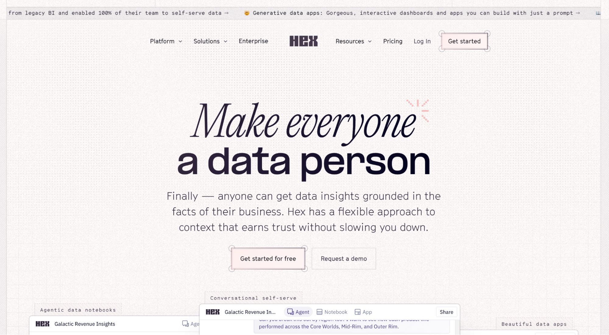
Screenshot of Hex homepage

Best for: Data teams that work in SQL and Python and want to share their analysis as interactive apps.

Hex is a collaborative data workspace that combines SQL and Python notebooks with publishable data apps and AI-assisted analysis. Where Looker centers on a semantic model, Hex centers on the analyst’s notebook. 

Data teams write the logic, then publish apps that business users can filter and explore. It suits companies with analysts who code against a cloud warehouse. Business teams mostly consume what analysts publish, so new questions still route back to the data team.

Key features

  • SQL and Python notebooks: Mix SQL and Python cells in one project and pass results between them.
  • Data apps: Turn notebook analyses into interactive apps and dashboards with inputs and filters.
  • AI-assisted analysis: Use Hex’s AI features to generate queries, explain results, and explore data conversationally.
  • Scheduled runs and Git sync: Refresh apps on a schedule and version projects with GitHub or GitLab.

Pros

  • Mixes SQL and Python in one notebook and keeps variables and tables so you can build on them 
  • Explore data, build interactive analyses, and share polished outputs in one collaborative place 

Cons

  • Slow load times and limited sharing permissions make dashboards hard to share with a wide audience 

5. Sigma
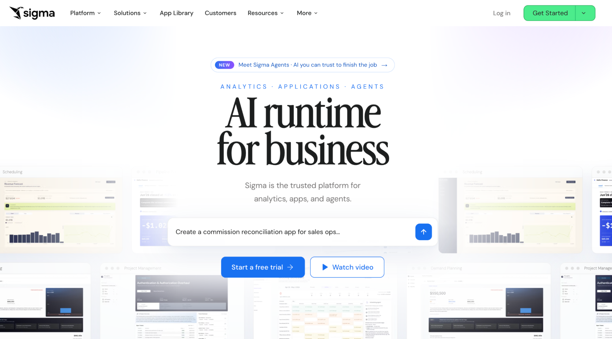
Screenshot of Sigma webpage

Best for: Teams on Snowflake, BigQuery or Databricks that want spreadsheet-style analysis on live warehouse data.

Sigma is a cloud BI platform with a spreadsheet-like interface that queries the warehouse directly. Looker needs LookML models before business users can explore. Sigma lets Excel-savvy users work in a familiar grid of rows, formulas, and pivots on top of live data. 

It fits companies that have already centralized their data in a cloud warehouse. Someone still has to set up the connections, datasets, and permissions, and large workbooks can slow down.

Key features

  • Spreadsheet-like workbooks: Sort, filter, pivot, and write formulas on warehouse data in a familiar grid.
  • Live warehouse queries: Query Snowflake, BigQuery, Databricks and Redshift directly, without extracts.
  • Input tables: Add or edit data in the warehouse straight from a workbook for planning and forecasting.
  • Sigma Agents and embedding: Build AI agents and apps on warehouse data, and embed dashboards in other products.

Pros

  • Building dashboards is easy, and the UI elements are more polished than in other tools 
  • Easy to embed with iframes or the SDK, and edits made in the UI save back to the data store 

Cons

  • Gets laggy when workbooks have many elements or large datasets, and advanced features aren’t intuitive at first 

6. Power BI
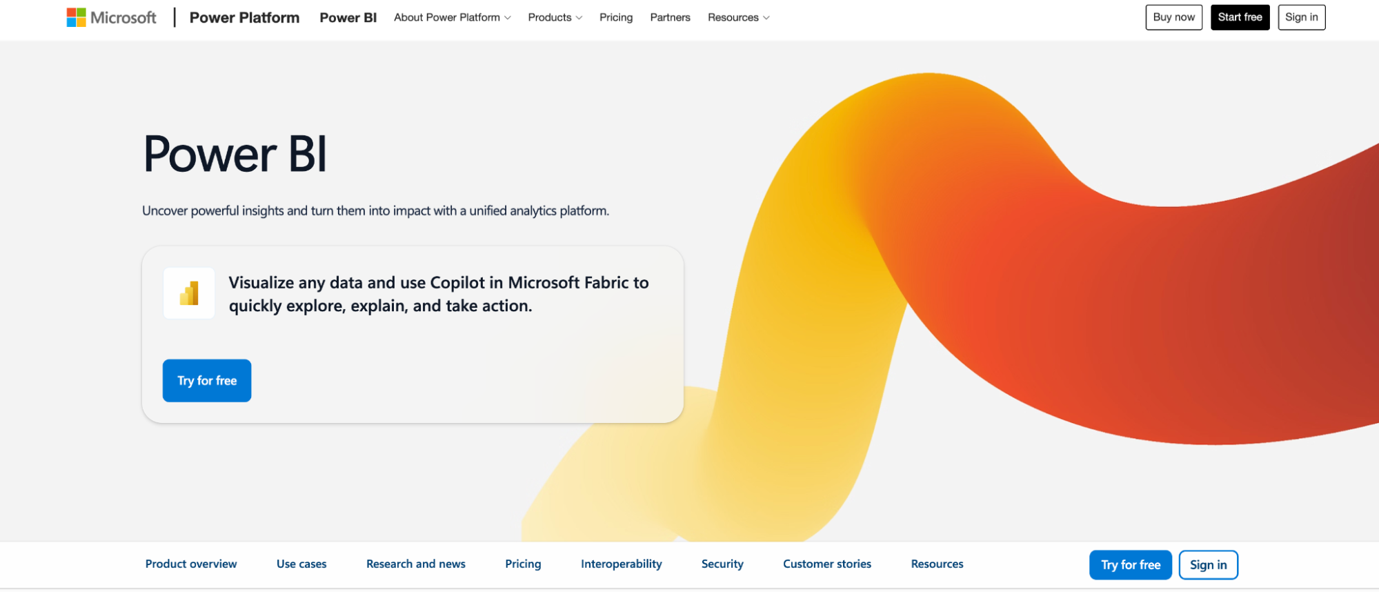
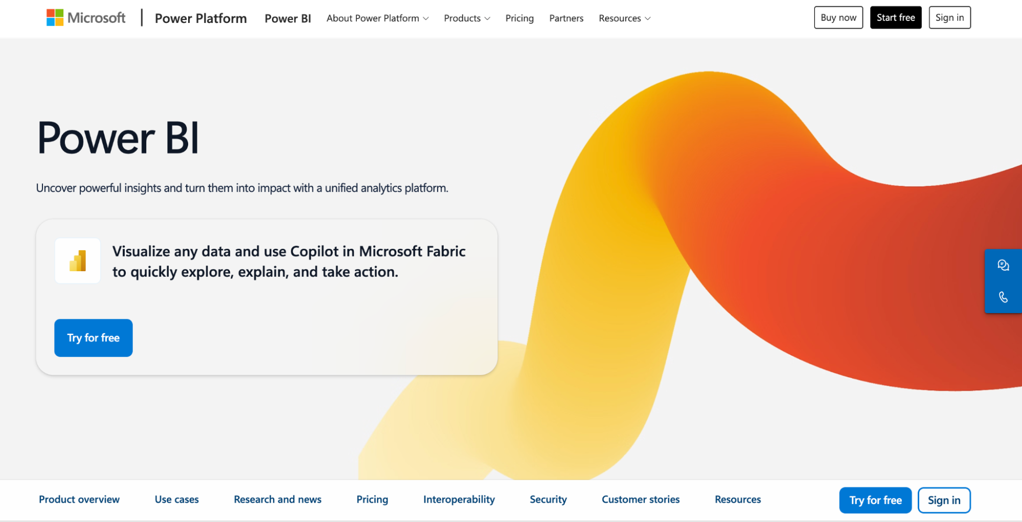
Screenshot of Power BI product page

Best for: Organizations on Microsoft 365 that want low-cost reporting inside Excel, Teams, and SharePoint.

Power BI is Microsoft’s BI platform, now part of Microsoft Fabric. It connects to Excel, SQL Server, and cloud sources, and turns them into interactive reports and dashboards. For Microsoft shops, it’s often the cheaper, more familiar alternative to Looker, which is tied closely to Google Cloud. Basic reports are easy to build, but anything more complex needs DAX formulas and data modeling. Business users still depend on BI developers for new analysis.

Key features

  • Power Query: Clean, reshape, and merge data from Excel, SharePoint, SQL Server, and cloud sources.
  • DAX and semantic models: Define relationships, measures, and calculations in reusable data models.
  • Copilot in Fabric: Ask questions in natural language, generate report pages, and summarize insights.
  • Microsoft 365 integration: Analyze Power BI data in Excel and embed reports in Teams and SharePoint.

Pros

  • Works with Excel, which makes it easy to use datasets you already have 
  • Power Query transforms data with little coding and connects to many sources 

Cons

  • DAX formulas and data modeling are hard for beginners to learn, and the error messages aren’t clear 

7. ThoughtSpot
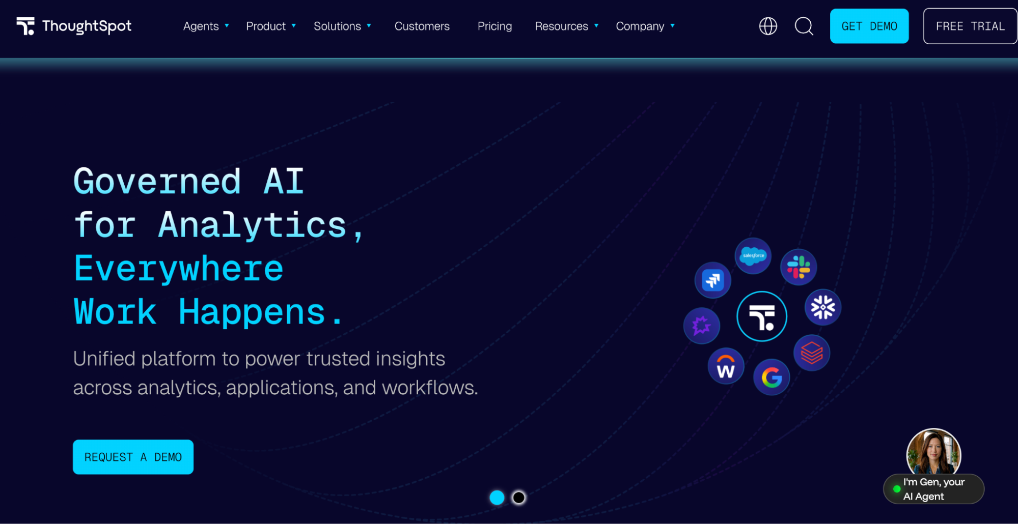
Screenshot of ThoughtSpot webpage

Best for: Enterprises with a modeled cloud warehouse that want business users to search their data in plain English.

ThoughtSpot is a search-and AI-driven analytics platform. Users type questions in natural language and get charts back, instead of building reports by hand. Looker asks business users to explore within LookML models. 

ThoughtSpot’s Spotter AI agent lets them ask questions directly. It works best once a data team has modeled the warehouse, and reviewers say the platform takes real time to learn beyond basic searches.

Key features

  • Natural language search and Spotter: Ask questions in plain English and get answers as charts and tables, with follow-up questions in the same conversation.
  • Liveboards: Build interactive, shareable dashboards on live warehouse data.
  • SpotIQ: Automatically surface anomalies, trends, and drivers behind changes in key metrics.
  • Live cloud warehouse connections: Query Snowflake, BigQuery, Redshift and Databricks directly, without moving data.

Pros

  • Makes data as easy to find as a web search, so every employee can work like an analyst 
  • Plain-English search cuts analysis time from hours to minutes and opens self-service to non-technical stakeholders 

Cons

  • Difficult to learn, with a confusing initial setup, and proficiency takes a long time to build 

8. Tableau
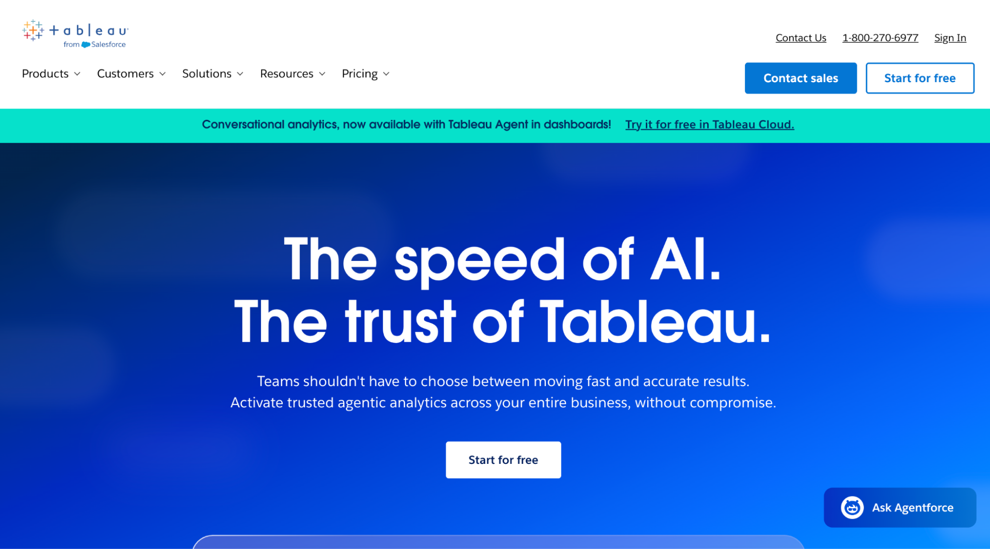
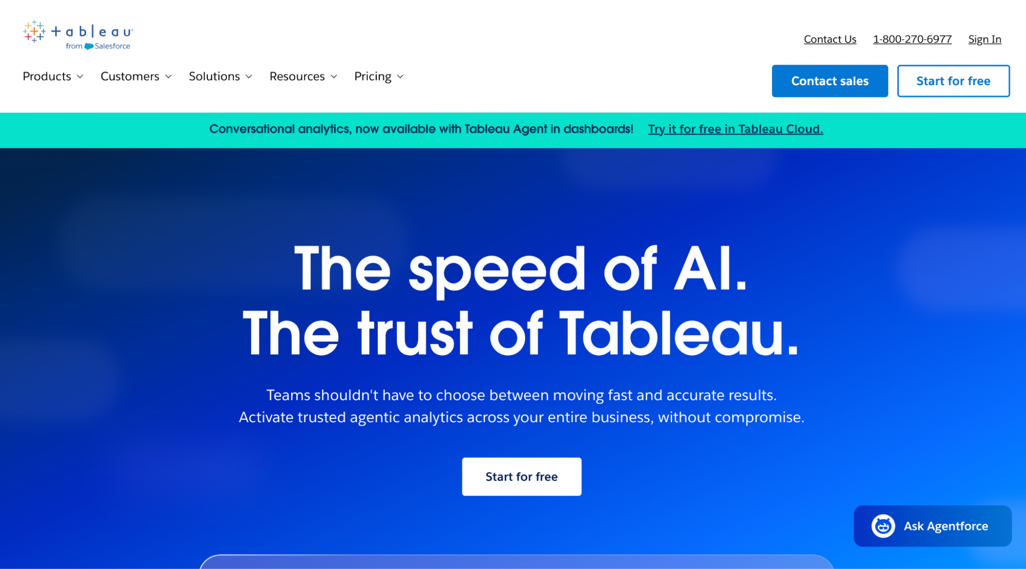
Screenshot of Tableau webpage

Best for: Analyst teams that build custom visual dashboards across many data sources.

Tableau is Salesforce’s BI platform, known for flexible drag-and-drop visualization. Looker defines metrics in code first. Tableau lets analysts start from the data and build visuals directly, which makes it stronger for exploration and visual storytelling. It works best when analysts build and maintain dashboards for other teams. Advanced calculations take time to learn, and licensing costs grow as more users need access.

Key features

  • Drag-and-drop visual analysis: Build charts, maps, and interactive dashboards with filters, drill-downs, and calculated fields.
  • Tableau Prep: Clean, join, and reshape data from multiple sources before analysis.
  • Tableau Pulse: Follow key metrics and get AI-generated digests and alerts in Slack or email.
  • Salesforce integration: Connect natively to Salesforce data, with Tableau Next adding agentic analytics on Data 360.

Pros

  • Turns operational data into interactive reports that are easier to understand than spreadsheets
  • The drag-and-drop interface lets you explore data without code, with filters and drill-downs for different business units 
  • Easy to connect to data sources ranging from simple spreadsheets to large databases 

Cons

  • Not very user-friendly for everyday users, and one CRM leader had to hire two people to implement it 

Questions to ask before choosing a Looker alternative

If you lead marketing, CRM, or customer insights, the right Looker alternative should get your team from question to action without a long wait on the data team. Here are five questions to ask before you choose.

1. Can business users get answers without a data model built first?

In Looker, business users can only explore data after engineers have modeled it in LookML. Every new question that falls outside the existing model goes back into the data team’s queue.

A good alternative should let marketing and CRM teams ask questions in plain English from day one. Ask the vendor what a business user can do before any semantic layer or custom model is in place, and have someone on your team try it during the demo.

2. Does it understand customer and campaign data out of the box?

General BI tools treat customer data like any other table. Someone still has to define what a lapsed customer, a high-value segment, or a campaign response looks like before the tool can answer questions about them.

Look for tools that already understand customer behavior, segments, loyalty, and campaign results. That way, questions like “Which customers are likely to churn this quarter?” don’t need custom modeling before you get a useful answer.

3. Can you act on the insight in the same place?

Most BI tools stop at the dashboard. Once you have the answer, someone still has to rebuild the audience in another tool, pick an offer, write the message, and set up the campaign.

The right tool should help you turn answers into next steps, such as building a segment, recommending an offer, or launching a campaign, without switching platforms. Ask the vendor to show you the full path from a customer question to a live campaign, not just the chart.

4. How long does setup take, and what does a pilot look like?

Looker rollouts often involve weeks or months of modeling work before business users see value. An alternative that needs the same groundwork won’t solve that problem.

Ask for a realistic timeline from kickoff to the first useful answer on your own data, and what the vendor handles for you. A strong vendor should be able to describe each phase of the pilot, who’s involved on both sides, and what your team will have at the end.

Choosing the right Looker alternative

Each tool in this guide addresses Looker’s limitations in a different way. Tableau and Power BI offer more flexible reporting, while Sigma, Hex, and Metabase give technical users faster access to warehouse data. 

However, most of them still stop at the dashboard, which leaves marketing teams to build the segment and launch the campaign in another system. aiRA by Capillary closes that gap. Marketing and CRM teams can ask questions in plain English, build segments and launch campaigns in one place, with human approval at every step.

Request a demo to see how aiRA works on your own customer data.

FAQs

1. What is the best alternative to Looker?

For marketing, CRM and loyalty teams, aiRA by Capillary is the best Looker alternative. You can ask about your customers in plain English, build a segment and launch a campaign in the same conversation, with no LookML model needed.

2. Why do companies look for Looker alternatives?

Looker is well rated on G2, but reviewers keep flagging the LookML learning curve, slow dashboards on large datasets and quote-only pricing. Business teams also end up waiting on data engineers for new questions.

3. What is the difference between Looker and Looker Studio?

Looker is Google Cloud’s enterprise BI platform, built on the LookML modeling layer and sold on annual contracts. Looker Studio, now renamed Data Studio, is Google’s free reporting tool for simple dashboards.

4. How much does Looker cost compared to its alternatives?

Looker has no published list price, and every edition needs a sales quote and an annual commitment. Some alternatives are cheaper to start with, such as Metabase’s free open-source version, though enterprise tools of every kind are usually quote-based too.

5. Is there a Looker alternative that doesn’t require LookML?

Yes. Most alternatives on this list don’t use a proprietary modeling language. For customer questions specifically, aiRA by Capillary lets marketers describe an audience in plain English and builds the segment without SQL or a semantic model.

Share

Similar Articles

Contact Us

Get the best loyalty & customer engagement platform out there!

  • Design industry shaping loyalty programs
  • Integrate easily and go live quicker
  • Deliver hyper-personalized consumer experiences
Request A Call

11 Best Conversational Analytics Tools in 2026 (Compared)

Conversational analytics tools let anyone ask a question about their data in plain English and get an answer in seconds, without writing SQL.

For marketing, CRM, and customer insights leaders, though, the answer is rarely the end of the work. Someone still has to build the audience, pick the offer, shape the message, and set up the campaign. And most tools in this category stop at a chart.

That’s why it’s worth looking closely at what each tool is actually built to do before you add it to your shortlist.

In this guide, we compare the 11 best conversational analytics tools. For each one, you’ll find who it’s best for, its key features, and pros and cons drawn from user reviews, so you can choose the right fit for your team.

Tl;dr 

Based on ease of use, understanding of customer data, trust, ability to act on insights, and governance, these are the top 10 conversational analytics tools worth considering in 2026:

  1. aiRA by Capillary: Best overall conversational analytics tool for marketing, CRM, and customer insights teams.
  2. Microsoft Power BI: Best for reporting within the Microsoft 365 ecosystem.
  3. Tableau: Best for custom visual dashboards built by analyst teams.
  4. Looker: Best for governed metrics on Google Cloud.
  5. ThoughtSpot: Best for search-based analytics on modeled warehouse data.
  6. Qlik: Best for exploring complex data across many sources.
  7. Domo: Best for connectors, data prep, and dashboards in one cloud platform.
  8. Sigma: Best for spreadsheet-style analysis on live cloud warehouse data.
  9. Tellius: Best for explaining metric changes in pharma and CPG analytics.
  10. Zenlytic: Best for an AI data analyst on top of a cloud data warehouse.
  11. Databricks: Best for companies already running a Databricks lakehouse.

Don’t want to read the long list of tools ahead?
You can sign up for a
demo of aiRA by Capillary and go from first conversation to full deployment in just 2–4 weeks.

What to look for in a conversational analytics tool

If you lead marketing, CRM, or customer insights, the right conversational analytics tool should help your team go from a question about your customers to action quickly. Here’s what to evaluate:

1. Ease of use for non-technical teams

Marketers should be able to ask questions in plain English and get useful answers in their first week. They shouldn’t have to write SQL or wait for the data team to model the data first.

2. Understanding of customer and campaign data

Look for tools that understand customer behavior, loyalty, and campaign results out of the box. The tool should already know what a lapsed customer or a redemption is, so you don’t need custom data models before getting useful insights.

3. Trust and explainability

The tool should show the query, the data sources, and the assumptions behind every answer. It’s the trust factor reviewers mention most, and it lets your team check an answer before acting on it.

4. Ability to act on insights

Most tools stop at a chart, and someone on your team still has to build the segment and set up the campaign. The best tools help you turn insights into next steps, like building a segment or launching a campaign, instead of stopping at a dashboard.

5. Enterprise security and governance

Anything customer-facing should need human approval and leave a full audit trail. Personal data should be masked before it reaches the LLM, and the tool should meet standards like GDPR, CCPA, and ISO 27001.

How this list was tested and selected

A good conversational analytics tool should let someone outside the data team ask a question about their customers and trust the answer. It shouldn’t need weeks of data modeling before it’s useful. And once you have the answer, it shouldn’t leave your team to do the rest by hand.

So we turned each of these needs into a criterion and checked every tool on this list against it. Here are the questions we asked when creating this list:

  • Learning curve: Can a non-technical user get a useful answer in their first week?
  • Setup: How much data modeling is needed before the first trustworthy answer?
  • Trust: Does the tool show where the answer came from and how it was calculated?
  • Action: Can you do something with the answer, or does the trail end at a chart?
  • Governance: Is there human approval and an audit trail on anything customer-facing?

Conversational analytics tools at a glance

Tool nameBest forStandout featureG2 ratingLimitation
aiRA by CapillaryEnterprise marketing, CRM, and loyalty teamsGoes from a plain-English question to a segment and a ready-to-launch campaign, with human approval at every step4.8/5Built for enterprise use cases, not start-ups
Microsoft Power BIReporting within the Microsoft 365 ecosystemCopilot summarizes reports and suggests visuals, with tight Excel, Teams, and SharePoint integration4.5/5Copilot depends on a data model built by BI developers; deeper analysis needs DAX
TableauCustom visual dashboards built by analyst teamsDrag-and-drop visual analysis, plus Tableau Agent and Pulse metric alerts4.4/5Natural language and data prep automation still need work
LookerGoverned metrics on Google CloudLookML semantic layer with Gemini-powered Conversational Analytics4.4/5LookML is hard to learn, so business users depend on data engineers
ThoughtSpotSearch-based analytics on modeled warehouse dataSpotter AI analyst with follow-up questions and shareable Liveboards4.4/5Steep learning curve; formulas don’t follow SQL or Excel conventions
QlikExploring complex data across many sourcesAssociative engine that filters every chart at once, plus Qlik Answers4.4/5Data load scripts take time to learn
DomoConnectors, data prep, and dashboards in one cloud platformBroad prebuilt connectors with Magic ETL and Domo AI Chat4.3/5Interface isn’t intuitive; pricing can be hard to predict
SigmaSpreadsheet-style analysis on live cloud warehouse dataSpreadsheet-like workbooks on live warehouse data, with Ask Sigma showing its steps4.4/5Can lag with large workbooks; advanced features aren’t intuitive at first
TelliusExplaining metric changes in pharma and CPG analyticsKaiya AI assistant with automated root cause analysis4.4/5Setting up data and Business Views takes technical effort
ZenlyticAn AI data analyst on top of a cloud data warehouseZoë AI analyst that shows the query and logic behind every answer4.0/5Limited customization; needs data in a cloud warehouse first
Databricks AI/BI GeniePlain-English questions on a Databricks lakehouseGenie Spaces curated by analysts, with Unity Catalog governance on every answer4.6/5Needs Databricks and Unity Catalog in place; can struggle with complex multi-table questions

The 11 best conversational analytics tool

1. aiRA by Capillary

Screenshot of aiRA by Capillary webpage. aiRA by Capillary is an analytics agent.

Best for: Enterprise brands that want conversational analytics built on their customer and loyalty data, not general business reporting.

aiRA by Capillary is an agentic AI co-pilot for marketing and loyalty teams, built into the Capillary Technologies platform. You can ask questions about your customers in plain English and get answers from your brand’s own data, with no SQL and no analyst queue. From there, aiRA builds the segment, recommends offers, rewards, messaging, and channels, and sets up the campaign, with your team approving every step.

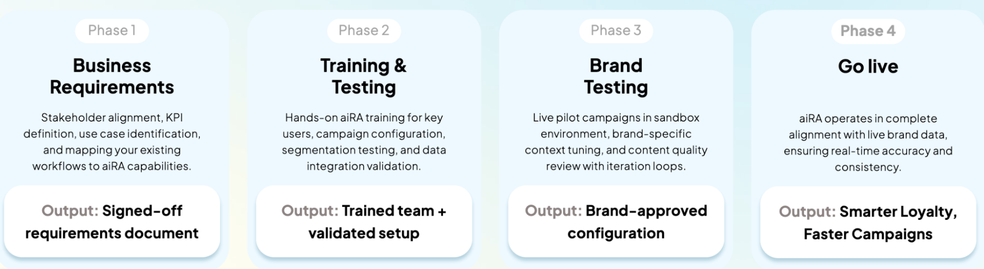
Typically, an enterprise campaign runs through five phases: strategy, segmentation, setup, launch, and measurement. This can involve 3+ teams and take 26+ days. aiRA brings all five phases into one conversation. A full deployment on your brand data takes 2–4 weeks, with a dedicated Capillary Technologies success manager throughout.

Watch this YouTube video to see how you can create a marketing campaign in aiRA

Key features

  • Conversational customer analytics: Ask questions in plain English to profile customers and spot behavioral trends like seasonal patterns and engagement signals.
  • Natural language segmentation: Describe an audience and aiRA builds the segment, with propensity scores and projected campaign value for each one.
  • Conversational campaign creation: Set up audience, rewards, messaging, and multi-channel delivery from a single brief, localized by region and language. aiRA also recommends ML-optimized rewards, predicts ROI by market, and explains each recommendation before you approve it.
  • Enterprise governance: Personal data is masked before it reaches the LLM, every AI interaction is logged, and no customer-facing action goes live without human approval. aiRA is ISO 27001 aligned and compliant with PCI DSS and GDPR/CCPA/PDPA.

Pros

  • Marketing teams build their own segments and campaigns, which saves 62+ analyst hours a month
  • Human approval on every customer-facing action and a full audit trail suit enterprise governance needs

Cons

  • Built for enterprise marketing, CRM, and loyalty use cases so it isn’t designed for start up companies

2. Microsoft Power BI

Screenshot of Power BI product page

Best for: Organizations already on Microsoft 365 that want to keep their reporting inside the Microsoft ecosystem.

Power BI is Microsoft’s business intelligence platform. Copilot adds a chat layer on top, so users can ask questions about their reports in plain English. It fits companies that already run on Excel, Teams, and SharePoint and have BI developers to maintain the data models.

Copilot only works as well as the data model behind it, so a technical team has to build that first. Deeper analysis still needs DAX. And the answers end at a report or a chart, so building the segment and launching the campaign happen elsewhere.

Key features

  • Copilot in Power BI: Ask questions about your reports in plain English and get summaries and suggested visuals.
  • DAX and semantic modeling: Define measures and relationships in data models that reports and Copilot draw on.
  • Microsoft ecosystem integration: Analyze data in Excel and share reports in Teams and SharePoint.

Pros

  • Copilot can summarize reports, answer questions about the data, and suggest visuals, which speeds up data exploration
  • Works well with Excel, which makes it easy to bring existing datasets into reports

Cons

  • Copilot isn’t very effective in Power BI yet, and the data cleanup tools sometimes fall short, so work goes back to Excel

3. Tableau

Screenshot of Tableau webpage

Best for: Analyst teams that build custom visual dashboards from many data sources.

Tableau is Salesforce’s BI platform, built around drag-and-drop visualization. Tableau Agent adds a chat layer, so users can ask questions about a dashboard in plain English. It fits companies with an analyst team that designs and maintains dashboards for everyone else.

What Tableau Agent can answer depends on the dashboards and data sources analysts have already set up. Complex calculations and data prep still need specialist skills. And the answer ends at a chart, so building the segment and launching the campaign happen in other tools.

Key features

  • Tableau Agent: Ask questions about your dashboards in plain English and get answers and suggested visuals.
  • Drag-and-drop visual analysis: Build charts, maps, and interactive dashboards with filters and drill-downs.
  • Tableau Pulse: Follow key metrics and get digests and alerts when they change.

Pros

  • The drag-and-drop interface makes it easy to explore data
  • Connects to a wide range of apps and data sources

Cons

  • Working with data in natural language and automating data prep both need work

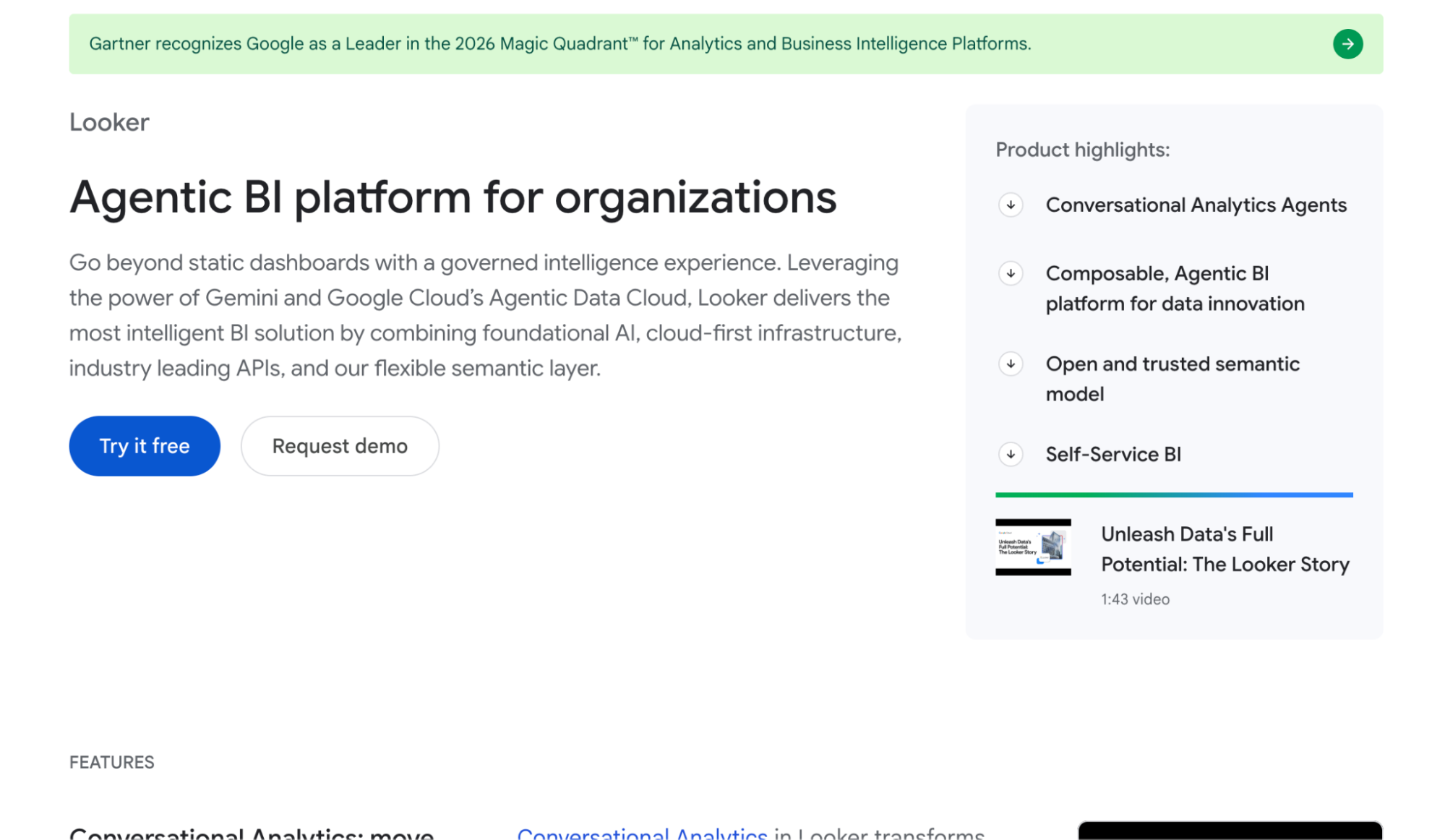
4. Looker

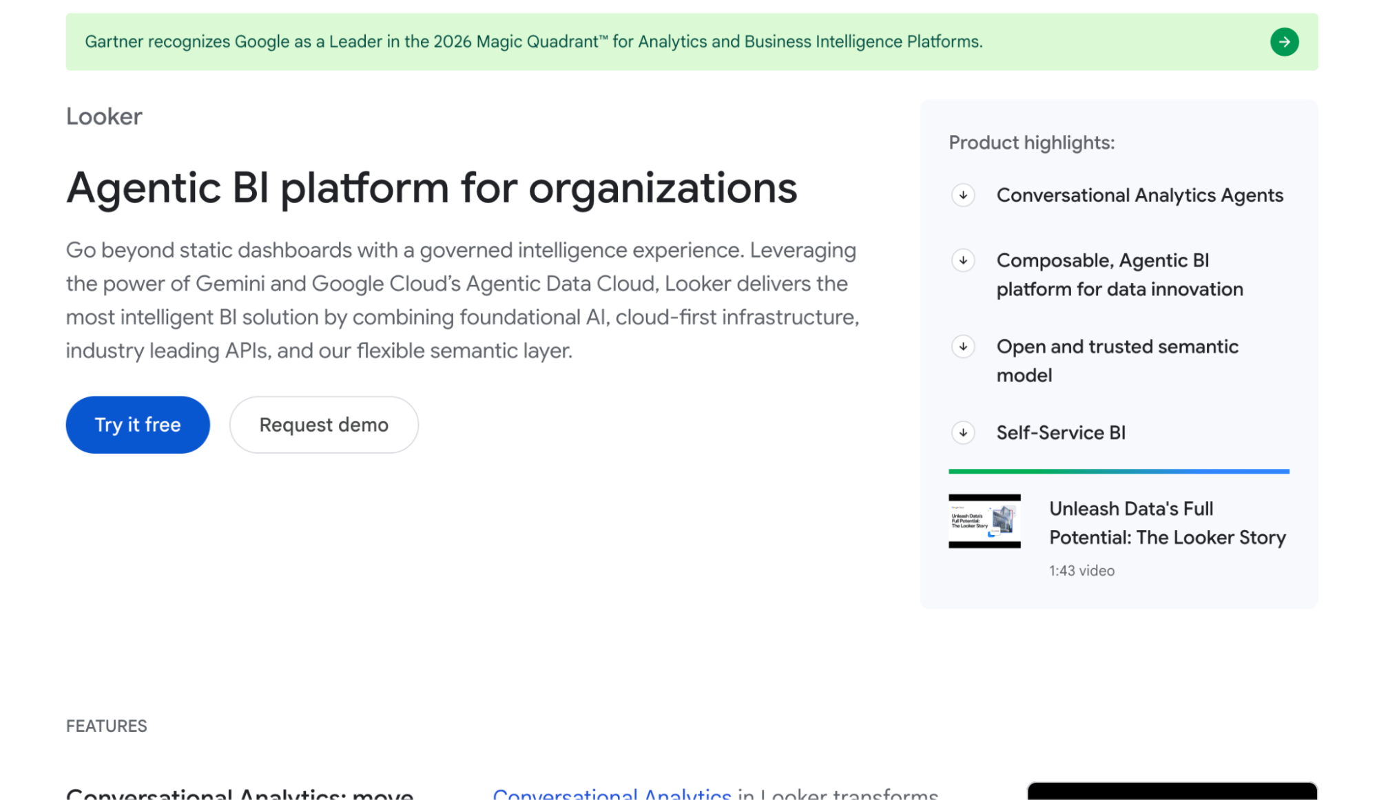
Screenshot of Looker webpage

Best for: Data teams on Google Cloud that want governed metrics defined in code.

Looker is Google Cloud’s BI platform, built around LookML, a modeling language data teams use to define metrics and business logic. Its Conversational Analytics feature, powered by Gemini, lets users ask questions about that modeled data in plain English. It suits companies with dedicated data engineers and a cloud data warehouse.

Business users can only ask about data that engineers have already modeled in LookML, so new questions often wait in the data team’s queue. And the answers end at a chart or a report, so acting on them happens in other tools.

Key features

  • Conversational Analytics: Ask questions about your LookML-modeled data in plain English, powered by Gemini.
  • LookML semantic layer: Define KPIs, joins, and business logic in code with Git version control.
  • In-database architecture: Query cloud warehouses like BigQuery and Snowflake directly without copying data.

Pros

  • Brings data from different sources into one place for dashboards and tracking metrics
  • Scheduled reports send the right numbers to inboxes every week without anyone running them by hand

Cons

  • LookML is hard to learn, so business users depend on data engineers and have little room for quick ad hoc analysis

5. ThoughtSpot

Screenshot of ThoughtSpot webpage

Best for: Data teams that want business users to search modeled warehouse data in plain English.

ThoughtSpot is a search-based analytics platform. Its AI analyst, Spotter, lets users ask questions in plain English and turns the answers into charts they can pin to Liveboards. It fits companies with a data team that has already modeled the warehouse.

The answers are only as good as the data models behind them, and building those models takes dimensional modeling skills. Formulas don’t follow SQL or Excel conventions, so customization comes with a learning curve. And the trail ends at a chart or a Liveboard, so the segment and campaign are built elsewhere.

Key features

  • Spotter: Ask questions in plain English and follow up to drill into the answer.
  • Liveboards: Pin answers to interactive dashboards and share them with your team.
  • Embedded analytics: Put search and Liveboards inside your own apps and portals.

Pros

  • Non-technical users can search data and build dashboards without much training
  • Surfaces insights quickly once the data is set up

Cons

  • Takes a long time to learn fully, and formulas are hard to build because they don’t use SQL or Excel formatting

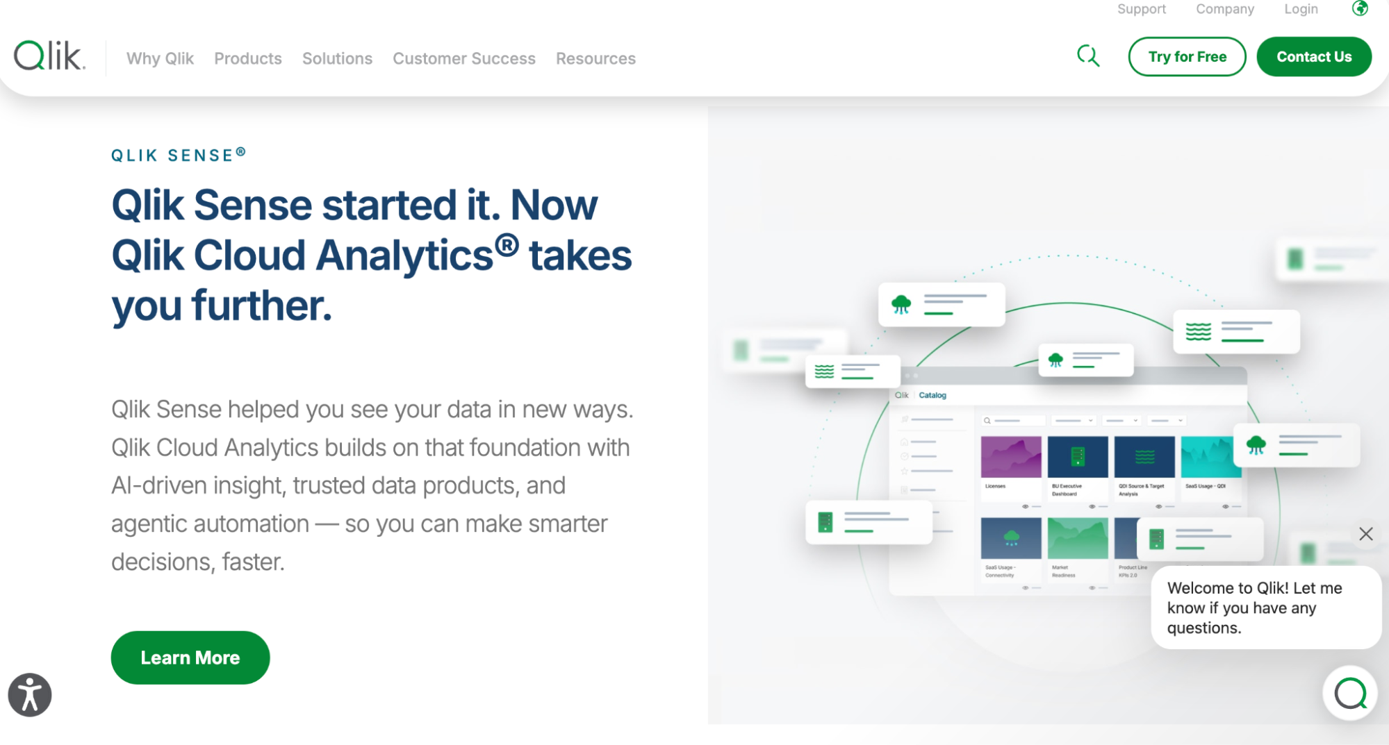
6. Qlik

Screenshot of Qlik webpage

Best for: BI teams that want to freely explore complex data from many sources.

Qlik Sense is Qlik’s analytics platform, built on an associative engine that lets users click through data in any direction. Qlik Answers and Insight Advisor add a conversational layer for asking questions in plain English. It fits organizations with BI developers who build and maintain the data models.

Data has to be loaded and modeled with Qlik’s scripts before business users can explore it, and those scripts take time to learn. The answers end in a chart or an app, so acting on them happens in other tools.

Key features

  • Qlik Answers: Ask questions in plain English and get answers with the sources behind them.
  • Associative engine: Click any value to filter every chart at once and see related and unrelated data.
  • Data load scripting and modeling: Combine and transform data from databases, SAP, cloud apps, and files.

Pros

  • Handles both ETL and dashboarding in one place, so it’s easier to prepare data and then present it
  • Pulls together data from many kinds of sources quickly

Cons

  • It takes a lot of time to learn the script functions and data load types, which beginners find hard

7. Domo

Screenshot of Domo webpage

Best for: Mid-size and large companies that want connectors, data prep, and dashboards in one cloud platform.

Domo is a cloud BI platform that combines data integration, transformation, and visualization. Domo AI adds a chat experience, so users can ask questions about their data in plain English. It fits companies that pull data from many business systems, with a BI team building the pipelines and dashboards.

Day to day, the BI team usually runs Domo, and pricing based on users and data volume can get hard to predict as more people join. The answers end at a card or a dashboard, so the segment and campaign are built elsewhere.

Key features

  • Domo AI Chat: Ask questions about your data in plain English and get charts and summaries.
  • Prebuilt data connectors: Pull data from ERPs, CRMs, ad platforms, databases, and spreadsheets.
  • Magic ETL: Clean, join, and transform datasets with a drag-and-drop pipeline builder.

Pros

  • Builds metric dashboards and integrates with ERP and SaaS products
  • Fast, powerful data transformations with a very broad range of data connections

Cons

  • The interface isn’t intuitive, and moving between boards and projects can feel jumbled

8. Sigma

Screenshot of Sigma webpage

Best for: Data teams on Snowflake or other cloud warehouses that want spreadsheet-style analysis on live data.

Sigma is a cloud analytics platform with a spreadsheet-like interface that queries the data warehouse directly. Ask Sigma lets users ask questions in plain English and see the steps behind each answer. It suits companies that have already centralized data in Snowflake, BigQuery, or Databricks.

Someone still has to set up the warehouse, datasets, and permissions first, and new users need time to learn the workbook model. The answers end in a workbook or a dashboard, so acting on them happens in other tools.

Key features

  • Ask Sigma: Ask questions in plain English and see the steps used to reach the answer.
  • Spreadsheet-like workbooks: Sort, filter, and write formulas on live warehouse data in a familiar grid.
  • Input tables: Add or edit data straight into the warehouse from a workbook for planning.

Pros

  • Building dashboards is easy, and the UI elements are more polished than in other tools
  • Easy to embed, and edits made in the UI save back to the data store

Cons

  • Gets laggy when workbooks have many elements or large datasets, and advanced features aren’t intuitive at first

9. Tellius

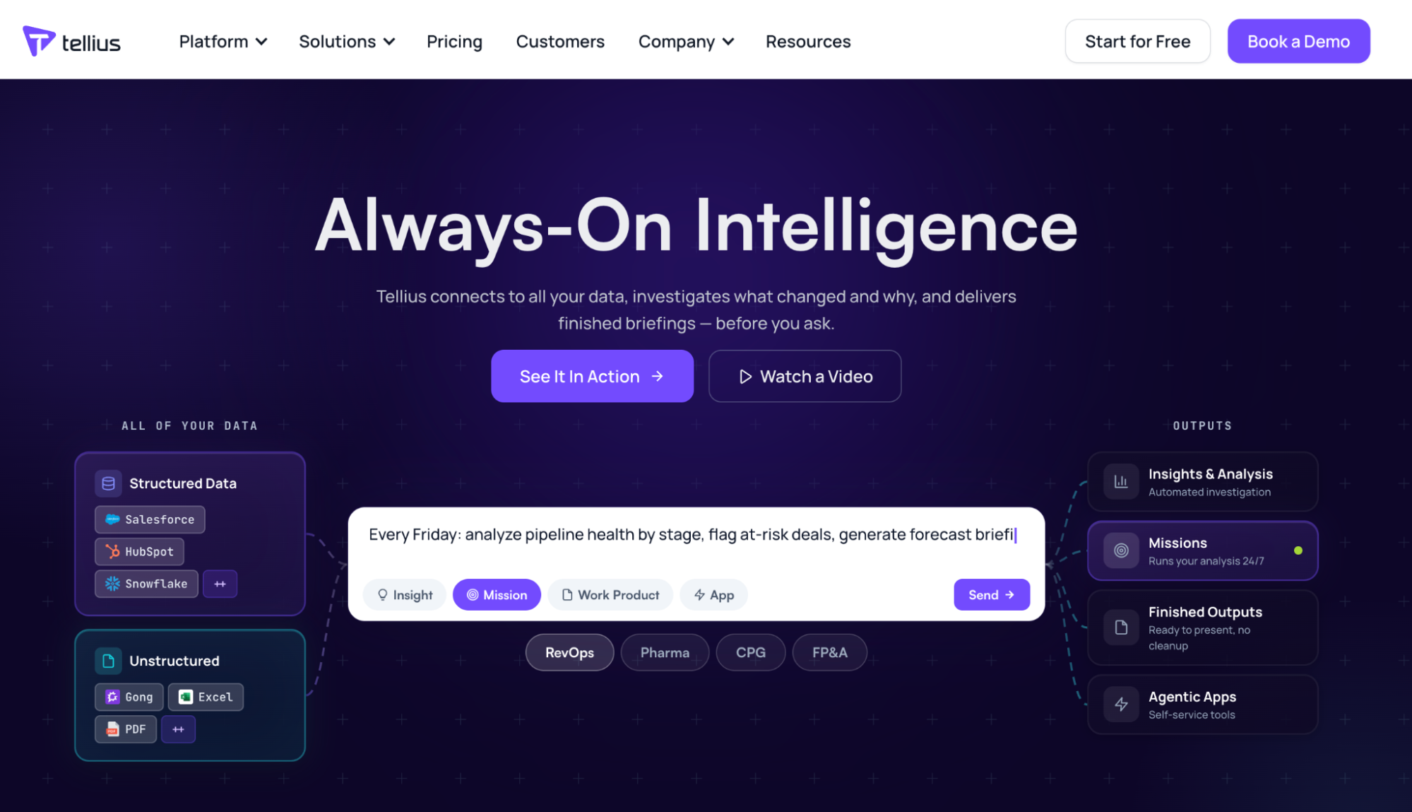
Screenshot of Tellius webpage

Best for: Pharma and CPG analytics teams that want AI to explain why their metrics changed.

Tellius is an agentic analytics platform. Its AI assistant, Kaiya, answers questions in plain English and runs automated root cause analysis on metrics in your warehouse. It’s used most by commercial analytics and FP&A teams in pharma and consumer goods.

Kaiya works from Business Views that a data team has to set up first. Its strength is explaining metric changes rather than working with customer and campaign data. Findings arrive as insights and reports, so building segments and launching campaigns happens elsewhere.

Key features

  • Kaiya: Ask questions in plain English and follow up in a conversation.
  • Automated root cause analysis: See which factors drove a change in a metric.
  • Proactive monitoring: Get alerts when key metrics change, in Slack, Teams, or the browser.

Pros

  • Natural language search makes it easy for business users to explore data
  • Automated insights save time on finding what drove a change

Cons

  • Setting up data and Business Views takes technical effort, and the interface takes time to learn

10. Zenlytic

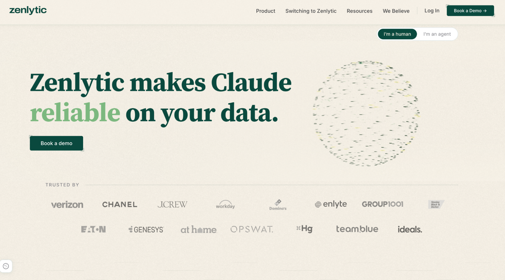
Screenshot of Zenlytic webpage

Best for: Data teams that want an AI analyst on top of their cloud data warehouse.

Zenlytic is a BI platform built around Zoë, an AI data analyst that answers questions in plain English and shows how each answer was calculated. It connects to cloud warehouses like Snowflake, BigQuery, and Databricks, and builds a semantic model in the background as users ask questions.

Your data has to be in a cloud warehouse first. Zoë learns definitions from your own schema, so it doesn’t come with built-in knowledge of loyalty or campaign data. The answers end in analyses, dashboards, and reports, so the segment and campaign are built in other tools.

Key features

  • Zoë AI data analyst: Ask questions in plain English and get charts, tables, and written analyses.
  • Explainable answers: See the query and business logic behind every result.
  • Governed semantic layer: Review and promote new definitions through Git-based workflows.

Pros

  • Gives business users a range of insights quickly without writing SQL
  • Shows the reasoning behind each answer, so results are easy to verify

Cons

  • Customization options are limited, and a few design details need polish

11. Databricks AI/BI Genie

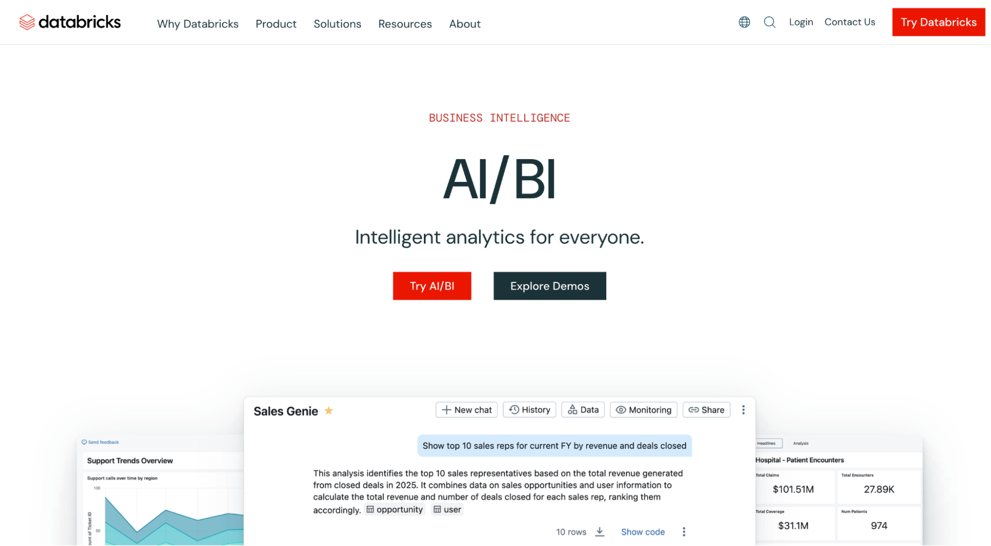
Screenshot of Databricks Genie

Best for: Companies already running a Databricks lakehouse that want business users to ask questions of governed data in plain English.

Genie is Databricks’ conversational analytics tool, part of its AI/BI suite. Business users ask questions in plain English and get answers backed by SQL, drawn from data governed in Unity Catalog. It fits companies that have already centralized their data in Databricks and have analysts to set up Genie Spaces for each team.

Genie is only as good as the Genie Spaces behind it, so analysts have to curate the tables, metric definitions, and sample queries first. Companies without an established lakehouse face significant setup work. And the answers end at a chart, a table, or a dashboard, so building the segment and launching the campaign happen in other tools.

Key features

  • Genie: Ask questions in plain English and get answers with the SQL behind them.
  • Genie Spaces: Analysts set up domain-specific spaces with verified metrics, sample queries, and business terms.
  • Unity Catalog governance: Existing permissions and data lineage apply to every answer Genie gives.

Pros

  • Business users can ask plain-English questions of curated data, which cuts down ad hoc requests to the data team
  • Brings data engineering, analytics, and machine learning into one platform

Cons

  • Genie can struggle with complex multi-table logic or domain-specific terms without tuning, and the wider platform has a steep learning curve

The ROI of conversational analytics tools for marketing and CRM teams

The right conversational analytics tool pays off in more than faster answers. Here’s where marketing and CRM teams see the return:

1. Less time waiting on analysts

When marketers can ask questions about their customers in plain English, they don’t have to file a request and wait days for a report. Analysts spend less time on one-off data pulls and more time on the work that needs their expertise.

2. Faster campaign turnaround

The gap between spotting an opportunity and launching a campaign shrinks when the insight, the segment, and the campaign setup all happen in one place. So you can respond to a drop in engagement or a seasonal trend while it still matters.

3. More relevant targeting

Segments built on real purchase behavior, engagement, and propensity scores reach the customers most likely to respond. Instead of sending one campaign to your whole base, you send the right offer to the right group, which lifts response rates and cuts wasted spend.

4. Lower analyst and agency costs

When your team can build segments and run analysis on its own, you rely less on outside agencies and extra analyst headcount for routine campaign work. That budget can go back into the campaigns themselves.

Case study: US healthcare provider with 90+ partner organizations

A leading US healthcare provider with 120M end customers ran loyalty programs across more than 90 partner organizations, each with its own requirements. Setting up each one took 16–20 specialists around three months per cycle, with full QA on every configuration, so the program couldn’t scale.

aiRA turned each partner’s requirements into a structured plan, checked it, and set up the programs automatically.

  • Configuration effort cut by 75%, from 90 days to 21
  • Scaled from 1 to 90+ partner organizations at the same time
  • 99.9% accuracy, with manual errors reduced to zero
  • Labor reduced by 80%, from 20 specialists to 4
  • 8,000+ promotions launched at the start of the year, and 200+ every month since

Want similar results?

Request a demo to see how aiRA works on your own brand data.

Choosing the right conversational analytics tool

A quick answer about your customers is useful. But for marketing, CRM, and customer insights leaders, the real value comes from what happens next: how fast that answer turns into the right audience, offer, message, and campaign.

Each tool on this list handles that differently. Some are built for analysts creating dashboards and reports. Others are built for data teams modeling metrics in a warehouse. If your priority is closing the gap between a question and a campaign, look for a tool that lets your team ask, segment, and act in the same place.

That’s what aiRA is designed to do. Marketing teams can ask questions in plain English, build segments with projected value, and turn those insights into ready-to-launch campaigns, with human approval at every step.

Request a demo to see how aiRA works on your own customer data.

FAQs

For marketing, CRM, and loyalty teams, aiRA by Capillary is the best conversational analytics tool. You can ask about your customers in plain English, build a segment, and launch a campaign from the same chat.
Conversational analytics lets you ask questions about your business data in plain English. Conversation intelligence analyzes customer calls, chats, and reviews, so what people call conversational analytics for VOC or CX is usually conversation intelligence.
Most BI-based tools do, because they query a cloud warehouse that a data team has already modeled. aiRA works directly on your brand’s customer data, with full deployment in 2–4 weeks.
They’re accurate when answers are grounded in your own data and a semantic layer that defines your metrics. The best tools also show the query and sources behind each answer, so you can check it before acting on it.
Most conversational analytics tools stop at a chart or a report. aiRA by Capillary takes you from a question about your customers to a segment and a ready-to-launch campaign, with your team approving every step.

Share

Similar Articles

Contact Us

Get the best loyalty & customer engagement platform out there!

  • Design industry shaping loyalty programs
  • Integrate easily and go live quicker
  • Deliver hyper-personalized consumer experiences
Request A Call

10 Best Retail Customer Analytics Platforms (Tested Against Real Buyer Criteria)

Most articles ranking for “retail customer analytics platform” fall into one of two categories. The first is a generic feature dump, the same comparison table recycled across a dozen sites with little to distinguish one entry from the next. The second is a vendor-funnel listicle, where the “top pick” was clearly decided before any real evaluation took place.

This guide takes a different approach. We evaluated 10 platforms against the criteria that actually matter to a B2B retail buyer: not simply what a dashboard reports, but whether the platform helps you act on that information.

Our top recommendation is aiRA by Capillary. Most retail customer analytics tools are effective at identifying your best customers or the channel that drove a sale, but converting that insight into a live campaign typically requires a separate tool and manual execution. aiRA removes that step, allowing a campaign to move from a plain-language prompt to launch without a handoff.

That said, aiRA is not the right fit for every retailer on this list. Organizations with an established, analyst-led BI function, or single-channel and single-location retailers who don’t yet need campaign automation, may find a better match further down this guide. The sections below outline where each platform fits, so you can identify the right one for your situation.

TL;DR

  • Best overall (analytics plus action): aiRA by Capillary, combines segmentation, CLV and churn analysis, and campaign execution in one platform, closing the gap between insight and action most tools leave open
  • Best for analyst-led BI teams: Databricks or Tableau, for deep, custom analysis with dedicated data teams
  • Best for single-location or single-channel retailers: native ecommerce and email tool reporting likely covers your needs for now

The Identity Resolution Problem Nobody Explains Properly

Every retail customer analytics platform depends on one thing working correctly before any of its reporting means anything: identity resolution, the process of recognizing that the person browsing on mobile, buying in-store, and opening emails on a laptop is the same customer, not three different ones.

This sounds like a technical detail, but it’s the actual foundation the entire category sits on. The identity resolution software market was worth roughly $1.8 billion in 2026 and is projected to grow at a 20% CAGR toward $4.48 billion by 2031, growth driven largely by retailers realizing that their customer data has been fragmented all along. They just didn’t have a name for the problem.

Here’s what that fragmentation looks like in practice. A customer browses your product catalog on their phone during lunch, walks into your store that evening and buys with a loyalty card, then opens a follow-up email on their laptop the next morning. Without identity resolution stitching those three touchpoints together, your platform sees three separate people. That means your CLV model is scoring three low-value customers instead of one high-value one. Your segmentation is splitting a single loyal shopper across three buckets. And your attribution report has no way of knowing the email actually closed a sale that started on mobile three days earlier.

This isn’t a hypothetical concern for retailers either. 62% of brand marketers already say first-party data will become more important to their strategy over the next two years, according to Econsultancy data cited by eMarketer, and identity resolution is what makes first-party data usable in the first place.

Most platforms handle this by sitting on top of, or building in, a customer data platform (CDP), the infrastructure layer responsible for unifying these fragmented records into one profile. But here’s the catch worth understanding before you evaluate any platform on this list: most tools either analyze that unified data or act on it, rarely both well. Knowing which one you’re getting is the difference between a platform that tells you something useful and one that actually does something with it.

How We Evaluated These Platforms

Most comparison content in this category evaluates software by feature count: more integrations, more dashboards, more AI-branded capabilities layered on top of one another. That approach tells you what a platform can technically do. It does not tell you whether it helps your team make a decision faster, which is the only metric that should determine a purchase.

We took a different approach. Each platform was scored against the decisions retail teams are actually trying to accelerate, not against a checklist of features.

Criterion 1: Who should you target? 

This measures segmentation and personalization capability, specifically whether a platform can group customers in a way that’s meaningful enough to act on, rather than relying on basic demographic slicing.

Criterion 2: Is this customer worth investing in?

This covers CLV prediction and churn scoring, the platform’s ability to identify which customers merit retention spend and which will not justify the investment regardless of effort.

Criterion 3: Did this channel actually drive the sale? 

This assesses attribution capability, whether a platform can credibly connect a marketing touchpoint to a transaction rather than defaulting ambiguous conversions to “direct” or “unknown.”

Criterion 4: Can the platform act on the insight, or does a person still have to?

This is the criterion most comparison guides overlook entirely. We evaluated whether each platform closes the gap between insight and execution or leaves that step for a human to complete manually in a separate tool.

Platforms were scored across all four criteria rather than ranked on a single standout feature. A platform with strong attribution but manual-only activation serves a fundamentally different buyer than one with lighter reporting depth that can launch a campaign directly from a prompt. Both approaches have a legitimate use case. The right choice depends on which decision your team needs to move faster on.

Top 10 Retail Customer Analytics Platforms

ToolBest forPricingImplementationInsight to action
aiRA by CapillaryRetailers running loyalty at scale who want analysis and campaign execution in one workflowCustom, within the Capillary contractWeeks for aiRA; 8 to 14 weeks for the Capillary rolloutLaunches campaigns from a prompt
VoyadoNorthern-European retail brands with no data teamPlatform fee plus volume (sessions, catalog size)WeeksActivation built in via Bonnie AI
KlaviyoEcommerce-native brands tying analytics to email and SMSActive-profile tiers, from $20/mo. SMS separate. Marketing Analytics is a $100/mo add-onDays to weeksActivation built in, deeper analytics costs extra
BloomreachEnterprise retailers needing personalization plus commerce searchModule fee plus usage, annual. Loomi AI includedSearch about 6 weeks, Engagement about 3 monthsActivation built in across email, SMS, web, mobile
InsiderOmnichannel retailers personalizing across 12+ channelsCustom, quote-basedWeeks to monthsActivation built in via Sirius AI
Salesforce AgentforceRetailers already on SalesforceFlex Credits $0.10/action or $2/conversation. Marketing Cloud from $1,500/org/mo. Data Cloud extraWeeks to monthsAgentic execution, gated behind Data Cloud
DatabricksEnterprise retailers with data engineers building a custom layerUsage-based compute, infrastructure billed separatelyMonthsModeling only. Needs a separate tool to activate
TableauTeams with in-house analysts needing custom visualizationCreator $75, Explorer $42, Viewer $15 per user/moMonthsReporting only
Power BIMicrosoft-stack retailersPro $14, Premium Per User $24 per user/moMonthsReporting only
RetailNextBrick-and-mortar in-store behavior analyticsCustom, sensors plus subscriptionMonths, includes sensor installReporting only


1. aiRA by Capillary

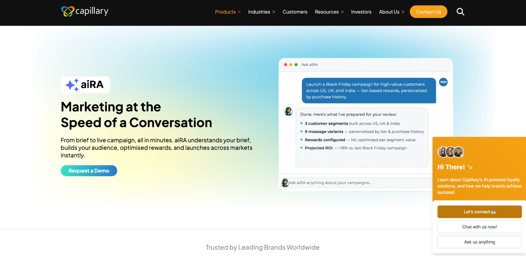
Screenshot of aiRA by Capillary product page

aiRA is Capillary Technologies’ agentic AI marketing and loyalty co-pilot, built to coordinate the full workflow that most platforms split across separate tools: customer segmentation, reward optimization, campaign creation, and performance analytics, all managed through a conversational interface rather than a series of dashboard handoffs.

The distinction that matters most for this list is what happens after the insight. Where most retail customer analytics platforms surface a segment or a trend and leave a marketer to build the campaign manually, aiRA moves directly from a plain-language prompt to a live, executed campaign. Analysis and action happen inside the same workflow instead of two.

The performance data supports this. In a Ramadan campaign for a fashion retailer in Saudi Arabia, aiRA outperformed a dedicated analytics agency on 8 of 9 measured KPIs, including a 29.4% increase in new customer acquisition. Separately, a consumer superapp using aiRA to manage promotion migration saw promo creation run 50% faster with zero configuration errors, a meaningful result for any retail team that has dealt with the manual error rate that comes with building promotions across multiple SKUs and channels by hand.

Key features

  • Conversational, prompt-based campaign creation and launch, no separate build step in a different tool
  • Customer segmentation and propensity modeling built into the same workflow as execution
  • Reward and loyalty program optimization, including personalized offer structuring
  • Omnichannel campaign coordination across the channels a retailer already runs
  • Performance measurement and analytics reported back within the same system used to launch the campaign

Honest limitations

  • Delivers the most value to retailers already running a loyalty program at scale
  • Custom, quote-based pricing, so retailers looking for a published starting price will need to request a quote

Worth being direct about fit here. aiRA delivers the most value to retailers who already run a loyalty program at meaningful scale. If you don’t yet have one in place, or you’re evaluating this purely as a lightweight analytics add-on, a different platform on this list may be a more practical starting point. This is one of the reasons we noted upfront that aiRA won’t be the right fit for every retailer reading this.

2. Voyado

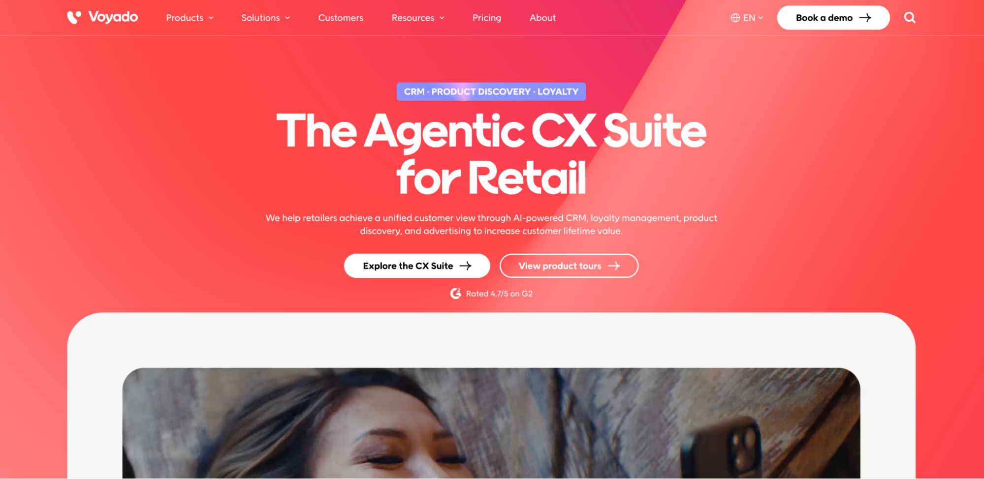
Screenshot of Voyado product page

Voyado is a retail-native customer platform built for Northern European retail brands that want analytics and activation without needing a dedicated data team to run it. Segmentation, campaign management, and its Bonnie AI layer for activation are built into a single platform designed to be operated by marketing teams directly.

Key features

  • Analytics and activation combined in one platform, no separate tool needed to act on a segment
  • Bonnie AI handles activation tasks like personalized recommendations and campaign support
  • Built specifically for retail use cases, with retail-relevant metrics and workflows out of the box
  • Designed for marketing teams to operate without heavy reliance on data or engineering resources

Honest limitations

  • The strongest fit is Northern European retail. Positioning and go-to-market are built around that region specifically
  • Platform fee plus volume-based pricing (sessions, catalog size) means costs can scale quickly for larger catalogs or high-traffic retailers
  • Less suited to retailers with complex, non-retail-specific data modeling needs

Voyado is a strong fit for retail brands in its core region that want activation built in without assembling a broader martech stack. Retailers outside Northern Europe, or those needing more specialized data infrastructure, may find it less tailored to their needs.

3. Klaviyo

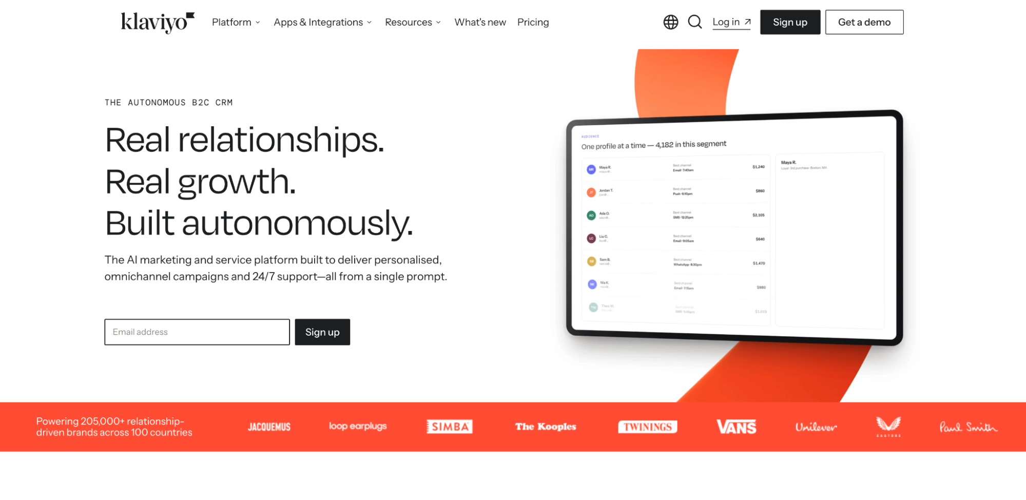
Screenshot of Klaviyo product page

Klaviyo is designed for ecommerce-native brands seeking customer analytics tied directly to email and SMS execution. Analytics and messaging operate within the same platform, allowing a segment to move into a live campaign without switching tools.

Key features

  • Deep native integration with ecommerce platforms, particularly Shopify
  • Email and SMS activation built directly into the platform
  • Active-profile-based segmentation that updates in real time as customer behavior changes
  • A Marketing Analytics add-on for deeper reporting beyond standard campaign metrics

Honest limitations

  • Pricing is based on active profiles across the full database rather than profiles emailed, so costs can rise as the list grows even without increased send volume
  • SMS is billed separately through credits, adding a second cost line to budget for
  • The deeper reporting layer, Marketing Analytics, is a $100/month add-on requiring 1,001+ profiles, not included in the base plan
  • Built primarily around email and SMS activation, making it less suited to retailers that need broader omnichannel coordination, such as in-store or paid media, within a single platform

Klaviyo is a strong fit for ecommerce-first brands that want analytics and messaging tightly integrated. Retailers with more complex omnichannel needs beyond email and SMS may need to pair it with additional tools.

4. Bloomreach

Screenshot of Bloomreach product page

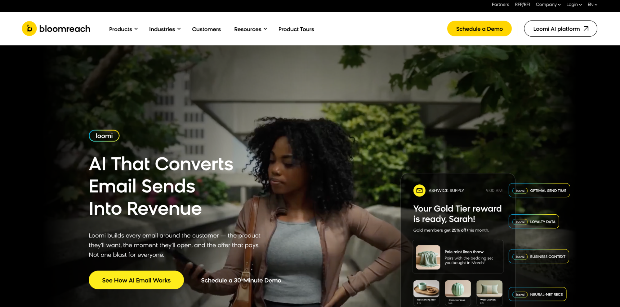
Bloomreach is built for enterprise retailers that need personalization paired with commerce search and product discovery. The platform combines its Engagement CDP with Loomi AI, giving retailers a way to personalize across email, SMS, web, and mobile from unified customer data.

Key features

  • Loomi AI powers personalization and content generation across channels
  • Commerce search and product discovery built alongside customer engagement, useful for retailers wanting both in one platform
  • Activation built in across email, SMS, web, and mobile
  • Enterprise-grade data unification through the Engagement CDP

Honest limitations

  • Two distinct products (Engagement and Discovery) rather than a single unified tool, each with its own implementation track
  • Autonomous Search implements in around six weeks, while Engagement typically takes closer to three months to reach active use, so a combined rollout extends further still
  • Enterprise positioning and module-based pricing make it a heavier commitment than lighter activation-focused platforms
  • Custom, annual pricing structure offers less transparency for retailers wanting to compare costs upfront

Bloomreach is a strong fit for enterprise retailers that specifically need commerce search and discovery alongside personalization. Retailers who only need activation and analytics may find a lighter platform faster to stand up, since Engagement carries the longer of the two timelines.

5. Insider

Screenshot of Insider product page

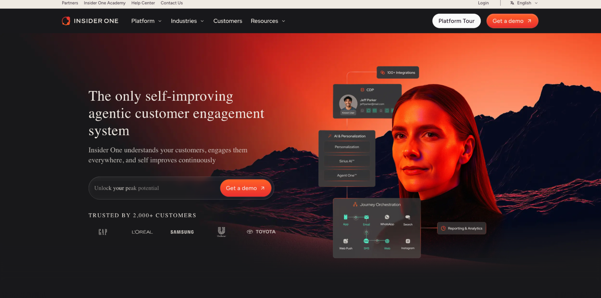
Insider is built for omnichannel retailers that need to personalize the customer experience across a wide range of channels, from web and app to messaging platforms. Its Sirius AI layer powers personalization and activation across more than 12 channels from a single platform.

Key features

  • Sirius AI drives personalization and automated decision-making across channels
  • Broad channel coverage, including web, app, WhatsApp, and other messaging platforms, beyond what most retail-native platforms support
  • Activation built directly into the platform, alongside analytics and segmentation
  • Designed for retailers managing complex, multi-channel customer journeys

Honest limitations

  • Custom, quote-based pricing offers limited transparency for retailers trying to benchmark cost upfront
  • Broad channel coverage can mean a steeper learning curve for teams not already managing that many channels
  • Implementation timelines run weeks to months, on the longer end for retailers without existing omnichannel infrastructure in place

Insider is a strong fit for retailers already operating across many channels who need one platform to personalize consistently across all of them. Retailers with a simpler channel mix may not need this level of breadth.

6. Salesforce Agentforce

Screenshot of Salesforce Agentforce product page

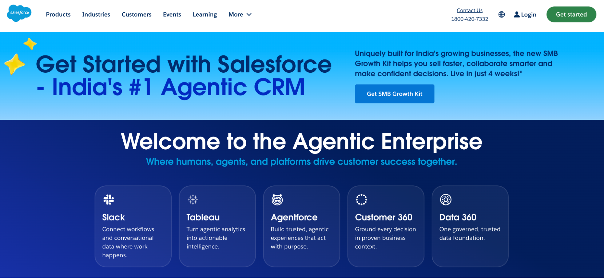
Salesforce Agentforce is built for retailers already operating within the Salesforce ecosystem who want agentic campaign execution without adopting a separate platform. It sits within Marketing Cloud and uses Data Cloud as its underlying data layer to power autonomous actions.

Key features

  • Agentic execution, campaigns can be built and launched autonomously rather than only reported on
  • Deep integration with existing Salesforce CRM and Marketing Cloud data, useful for retailers already invested in that ecosystem
  • Flexible consumption-based pricing options (per-action credits or per-conversation) alongside traditional org-level licensing

Honest limitations

  • Agentic capability is gated behind Data Cloud, an additional cost most retailers will need to factor in separately
  • Pricing is fragmented across several models: Flex Credits at $0.10 per action, a flat $2 per conversation alternative, Agentforce 1 Editions from $550/user/month, and Marketing Cloud itself starting at $1,500/org/month, making total cost harder to estimate upfront than a single subscription price
  • Best suited to retailers already committed to the Salesforce ecosystem, less practical as a standalone choice for retailers not already using Salesforce

Salesforce Agentforce is a strong fit for retailers who want agentic execution but are unwilling to leave their existing Salesforce investment. Retailers not already on Salesforce will likely find the total cost and complexity of adoption harder to justify than a purpose-built retail platform.

7. Databricks

Screenshot of Databricks product page

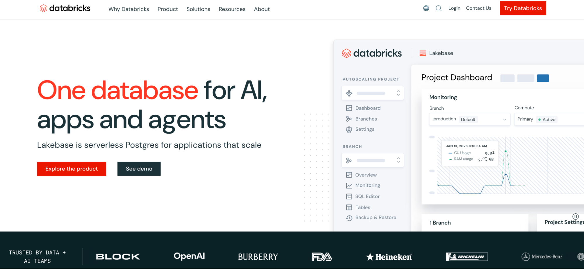
Databricks is built for enterprise retailers with in-house data engineering resources who want to build a custom customer analytics layer on top of their own data infrastructure. It provides the modeling and data intelligence foundation, but retailers need a separate tool to act on what it surfaces.

Key features

  • Full data intelligence platform capable of supporting custom CLV, segmentation, and attribution models at scale
  • Highly flexible, suited to retailers with unique data structures that off-the-shelf platforms can’t accommodate
  • Strong fit for retailers already using Databricks for other data engineering or analytics workloads

Honest limitations

  • Modeling only, activation requires a separate tool, so insights don’t translate into a live campaign without additional integration work
  • Requires dedicated data engineering resources to build and maintain, not designed for marketing teams to operate independently
  • Usage-based compute pricing, with cloud infrastructure billed separately from DBU consumption, makes total cost harder to predict than flat subscription pricing
  • Implementation typically takes months given the technical setup involved

Databricks is a strong fit for enterprise retailers that already have the technical resources to build a custom analytics layer and simply need the infrastructure to do it. Retailers without a dedicated data engineering team, or those wanting to act on insights directly, will find this a heavier lift than a purpose-built retail platform.

8. Tableau

Screenshot of Tableau product page

Tableau is built for retail teams with in-house analysts who need flexible, custom data visualization rather than a pre-built retail analytics workflow. It’s a general-purpose BI tool that can be configured for retail use cases, but the configuration work falls on the retailer.

Key features

  • Highly customizable dashboards and visualizations, suited to analysts who want full control over how data is presented
  • Broad data source connectivity, able to pull from POS, ecommerce, and other systems with the right setup
  • Strong for ad hoc analysis and exploratory reporting beyond fixed retail metrics
  • Widely adopted, meaning analyst talent familiar with the tool is easier to find than for niche retail platforms

Honest limitations

  • Reporting only, with no built-in activation. Segments and insights still need to be exported to a separate tool to act on
  • Requires dedicated analyst time to build and maintain dashboards, not designed for marketing teams to self-serve
  • Per-user licensing (Creator $75, Explorer $42, Viewer $15 per month) adds up quickly across larger teams
  • Implementation typically takes months due to the data modeling work required before dashboards are useful

Tableau is a strong fit for retailers that already have analyst capacity and want maximum flexibility in how customer data is visualized. Retailers without dedicated analysts, or those wanting a tool that also activates campaigns, will find this better suited as a reporting layer than a full solution.

9. Power BI

Screenshot of Power BI product page

Power BI is built for retailers already operating in the Microsoft ecosystem who want BI reporting integrated with tools they already use, like Excel, Azure, and Teams. It offers similar core capability to Tableau at a generally lower cost, provided the retailer’s data infrastructure already sits within Microsoft’s stack.

Key features

  • Native integration with Microsoft products, useful for retailers already standardized on Excel, Azure, or Dynamics
  • Lower per-user cost than Tableau, making it more accessible for teams scaling BI access across the organization
  • Strong for retailers wanting to combine customer data with other business reporting (finance, operations) in one platform
  • Regular feature updates tied to the broader Microsoft ecosystem roadmap

Honest limitations

  • Reporting only, no built-in activation, the same gap as Tableau, insights still require a separate tool to turn into a campaign
  • Best suited to retailers already on Microsoft infrastructure, less advantageous for retailers on other cloud or data stacks
  • Per-user pricing (Pro $14, Premium Per User $24 per month) is lower than Tableau but still requires dedicated analyst time to build meaningful dashboards
  • Implementation typically takes months, similar to Tableau, due to the data modeling work involved

Power BI is a strong fit for retailers already invested in the Microsoft ecosystem who want cost-efficient BI reporting. Retailers outside that ecosystem, or those needing built-in activation, will find this addresses reporting only, not execution.

10. RetailNext

Screenshot of RetailNext product page

RetailNext is built for brick-and-mortar retailers that need visibility into physical, in-store customer behavior, the half of the customer journey that ecommerce-focused platforms can’t see. It uses Aurora IoT sensor technology to track foot traffic, dwell time, and in-store conversion.

Key features

  • Aurora IoT sensors capture foot traffic, dwell time, and conversion patterns across physical store locations
  • Purpose-built for in-store analytics, filling the gap that ecommerce and CDP-focused platforms leave open
  • Store-level and multi-location reporting, useful for retailers managing performance across a physical footprint
  • Data can support omnichannel measurement when combined with a digital-side platform

Honest limitations

  • Reporting only, no activation, insights need a separate platform to turn into a targeted campaign
  • Requires hardware installation (sensors) in addition to software, adding cost and lead time beyond a typical software-only rollout
  • Implementation runs months, including physical sensor installation across locations, the longest timeline on this list
  • Doesn’t address digital customer behavior on its own, retailers need a complementary platform for online-side analytics

RetailNext is a strong fit for retailers with a significant physical footprint who need in-store behavioral data they can’t get anywhere else. Retailers that are primarily digital, or want a single platform covering both online and offline behavior, will find this addresses only one half of the picture.

Your Checklist Before the Demo Call

A vendor demo is designed to show you what the platform does well. It won’t volunteer what it doesn’t do. These questions are meant to close that gap before you sign anything.

  • Integrations: Ask directly whether the platform connects to your POS, ecommerce system, loyalty program, and ESP without additional engineering work. If the answer involves a multi-month implementation project before you see any value, that’s a cost worth factoring into your decision now, not after the contract is signed.
  • Real-time vs. batch: Confirm whether you’re working with customer behavior as it happens, or with data that’s already a day old by the time a campaign goes live. For most retail use cases, that lag is the difference between a relevant offer and a missed one.
  • Usability for non-analysts: Bring someone from your marketing team into the demo, not just your data lead. If every question requires a data analyst to translate into a query, that dependency doesn’t go away after onboarding, it becomes a permanent part of how the tool gets used.
  • Activation vs. reporting-only: Look past the dashboard walkthrough and ask what happens after the insight. Does the platform stop at telling your team what to do, or can it act on that information directly?
  • Privacy compliance: Ask whether consent management, GDPR, and CCPA compliance are built into the platform itself, or whether your team will need to manage that separately on top of it.
  • Pricing transparency: Push for an actual number. If every answer routes back to “let’s get you on a call with sales,” that’s worth noting, since it often means pricing is negotiated case by case rather than tied to clear value.

One question matters more than the rest, and it’s worth making it the one you lead with: does this tool require a separate step to turn an insight into a live campaign, or can it launch one on its own? Most platforms on this list can answer the first six questions competently. Very few can answer this one with a yes, and that single answer will tell you more about fit than anything else in the demo.

Where This Leaves You

Retail customer analytics has moved past the question of what happened. The platforms that matter now are the ones that help you decide what to do next, and increasingly, do it. As agentic capabilities mature across this category, that insight-to-action gap is likely to keep closing, and the platforms slow to adapt will start to feel it.

Most of the platforms covered in this guide will answer the first six checklist questions competently. Integrations, real-time data, usability, compliance, and pricing are largely table stakes at this point in the category’s maturity. Very few can answer the last question with a yes.

That gap comes down to a handoff most retail teams have learned to live with. A platform tells you who to target through segmentation, or which customers are worth the investment through CLV modeling. From there, someone still has to build the campaign, route it for approval, and push it live, usually in a separate tool, on a separate timeline. That handoff is where speed dies, and it’s the step most comparison guides never ask about because it’s not something a feature list captures.

This is the exact gap aiRA by Capillary was built to close. Instead of ending at the insight, it moves directly from a plain-language prompt to a live, personalized campaign, with no separate build step in a separate system. The result isn’t theoretical: in a Ramadan campaign for a fashion retailer in Saudi Arabia, aiRA outperformed a dedicated analytics agency on 8 of 9 measured KPIs, a strong signal that closing the loop between insight and execution produces measurably better outcomes than the traditional handoff model.

That’s the distinction this entire guide has circled back to. Analytics that inform a decision are useful. Analytics that execute one are a different category of value entirely, and it’s the reason aiRA leads this list.

See what aiRA can do for your retail team

FAQs

Retail customer analytics vs. CDP: what's the difference?

Retail customer analytics analyzes behavior to inform decisions, like targeting, churn risk, and channel performance. A CDP unifies customer identity across touchpoints into one profile. Most retailers need both, a CDP to unify the data and analytics to act on it.
For single-channel retailers, yes, native platform reporting plus a free analytics tool usually covers it. Once you’re running multiple locations, channels, or a loyalty program at scale, free tools create more manual work than they save.
Turnkey platforms can go live in days to weeks. Traditional BI tools take two to four months. Complex enterprise suites can run three to six months or longer.
Single-channel retailers can often use free or low-cost tools. Mid-market retailers typically budget in the low thousands per month. Enterprise retailers with complex operations often move into five-figure monthly commitments. Always ask for the total cost, not just the license fee.
A traditional tool tells you what’s happening, who to target, who’s at risk, what drove a sale. Acting on it still takes a person and a separate step. An agentic copilot closes that gap, turning a plain-language request directly into a live campaign.

Share

Similar Articles

Contact Us

Get the best loyalty & customer engagement platform out there!

  • Design industry shaping loyalty programs
  • Integrate easily and go live quicker
  • Deliver hyper-personalized consumer experiences
Request A Call

10 Best Power BI Alternatives for Faster, AI-Driven Insights in 2026

Introduction

Your dashboard says repeat purchases dropped 12% in the last quarter. That tells you what happened. It doesn't tell you what to do next. For most marketing teams, the next step is a ticket to the data team, a wait of several days for a segment, and another round of back-and-forth before a campaign goes live. By then, the moment has often passed.

Power BI deserves credit. It is one of the most widely adopted business intelligence platforms in the world. Its visualizations are strong, its pricing entry point is accessible, and it fits naturally into the Microsoft ecosystem of Excel, Azure, Teams and SharePoint. For finance and operations reporting, it is often a sensible default. Still, many teams are now evaluating Power BI alternatives, and the reasons tend to repeat:

  • DAX and data modeling take real skill to learn. Business users rarely move past basic reports on their own.
  • Analysts become a bottleneck. Every new question or segment adds to the data team's queue.
  • Refresh limits and licence costs add up as usage grows.
  • Nothing connects insight to action. A dashboard can show a problem, but it can't build the audience, choose the offer or launch the campaign.

This guide ranks the best Power BI alternatives for 2026. The list covers AI-native conversational analytics platforms as well as established enterprise BI suites. For each tool, you'll find key features, pros, cons, pricing and the use case it suits best, so you can match the platform to the people who ask the questions and to what they need to do with the answers.

TL;DR

  • Power BI is a capable BI tool. Its main limits are the technical skill it requires, the dependence on analysts, and the lack of a built-in path from insight to execution.
  • aiRA by Capillary is the top pick for marketing and loyalty teams. You ask questions in plain English, build segments without SQL, and launch campaigns from the same conversation.
  • Tableau is best for advanced visualization. Looker is best for governed, centralized data modeling.
  • ThoughtSpot and Sigma Computing suit search-led or spreadsheet-style self-service analytics.
  • Qlik Sense is strong for associative exploration, Domo for real-time integration, and Sisense for embedded analytics.
  • Zoho Analytics and Amazon QuickSight are the most budget-friendly options.
  • How to choose? Decide who asks the questions (analysts or business users) and what has to happen once the answer arrives.

What is Power BI?

Microsoft Power BI is an analytics and data visualization platform that lets organizations connect to data sources, build data models, and publish interactive dashboards and reports. Teams use it for KPI tracking, financial reporting, sales performance and operational monitoring.

Its biggest advantage is its place in the Microsoft ecosystem. It works well with Excel, runs on Azure, and lets users share reports in Teams and SharePoint. It is available as Power BI Desktop (free for authoring), Power BI Pro, Premium Per User, and capacity-based licensing through Microsoft Fabric.

For analyst-led teams already committed to Microsoft, this setup works well. For business users who need answers quickly and need to act on them, gaps begin to show. Those gaps are why the search for Power BI competitors keeps growing.

Why teams are looking for Power BI alternatives

Steep learning curve for DAX and data modeling

Power BI's modeling layer is powerful, but it depends on DAX (Data Analysis Expressions), a formula language that takes real time to learn. Relationships, measures, calculated columns and filter context all need training. Most business users can use existing reports, but they can't build new analysis on their own. That caps how far self-service really goes.

Analyst dependency and ticket queues

Because building new views takes expertise, questions are routed to the data team. A marketer who wants to know which lapsed high-value customers bought outerwear last winter usually can't get that from a dashboard. They file a request and wait. For teams running frequent campaigns across several markets, these queues turn into a hidden, recurring cost.

Performance strain on large datasets

Large data models, complex visuals and high-cardinality customer data can slow reports down. Getting good performance usually involves aggregations, incremental refresh, or a move to premium capacity, all of which require more technical work and often more spending.

Refresh limits and licensing costs that add up

Power BI Pro limits how many scheduled refreshes each dataset gets per day, so near-real-time use cases typically need Premium Per User or Fabric capacity. Per-user fees are modest at a small scale, but they grow quickly as more people need access to shared content.

Insights stop at the dashboard

This is the biggest gap for customer-facing teams. Power BI shows what is happening, but it has no native way to turn a finding into an audience segment, a reward, or a live multi-channel campaign. Someone still has to export the data, rebuild the segment in another system, design the offer and set up the launch. The distance between knowing and doing is where both revenue and time are lost, and it is exactly the gap the first tool on this list is built to close.

How to choose the right Power BI alternative

Before comparing tools, agree internally on your evaluation criteria. These six factors separate a good fit from an expensive mistake:

  1. Natural-language querying: Can users ask questions in plain English without writing SQL or DAX?
  2. Self-service for non-technical users: Can marketers, merchandisers and managers get answers on their own, without analyst help?
  3. Time from insight to action: Does the platform stop at the chart, or does it help you act on what you learned?
  4. Data governance, PII protection and compliance: How does the tool handle sensitive customer data, especially when AI or LLMs are involved?
  5. Scalability and integrations: Does it connect to your warehouse, CRM and engagement stack, and does it perform well as data volumes grow?
  6. Pricing transparency and time to deploy: How quickly can you go live, and how predictable are costs as adoption grows?

Power BI alternatives compared: features, best use cases and pricing

Tool Best for Natural-language querying Ease of use Insight-to-action Free trial Starting price
aiRA by Capillary Marketing and loyalty teams Yes Very high Built-in (segments, rewards, campaigns) Demo / pilot Custom
Tableau Advanced visualization Partial Medium No Yes Per user
ThoughtSpot Search-based self-service Yes High Limited Yes Tiered
Looker Governed data modeling Partial Low-Medium No Yes Custom
Qlik Sense Associative exploration Partial Medium Limited Yes Tiered
Domo Real-time data integration Partial Medium Limited Yes Custom
Sigma Computing Spreadsheet-style cloud analytics Partial High Limited Yes Custom
Amazon QuickSight AWS-native, usage-based BI Yes Medium No Yes Usage-based
Sisense Embedded analytics Partial Medium Limited Demo Custom
Zoho Analytics SMBs on a budget Partial High No Yes Low monthly tiers

10 best Power BI alternatives for 2026

#1 top pick

1. aiRA by Capillary: best for conversational analytics that turns insights into campaigns

aiRA is Capillary Technologies' agentic AI co-pilot. It is built into the Capillary loyalty and customer engagement platform and trained on each brand's own context with its customers, programs, rewards and history. Traditional BI tools give you a dashboard and leave the rest to you. aiRA answers questions about your customers in plain English and then carries that answer forward into a segment, a reward strategy and a live campaign, all within one conversation.

Why aiRA is a strong Power BI alternative

The simplest way to see the difference is to compare the two workflows side by side:

  • The Power BI workflow: An analyst builds a dashboard. A marketer spots a trend. The marketer files a request for a segment. The data team writes SQL and exports a list. The CRM team rebuilds the audience in another tool. The loyalty team designs an offer. The campaign team sets up messaging for each channel and market. Finally, someone builds a separate report to measure results.
  • The aiRA workflow: A marketer asks a question, reviews what aiRA finds, approves a recommended segment and reward, and launches the campaign. Measurement is set up from the start.
  • Capillary describes the impact this way: Without aiRA, a typical enterprise campaign workflow involves about five phases, three or more teams, and more than 26 days. With aiRA, the same workflow takes minutes. Power BI stops at the dashboard. aiRA covers strategy, segmentation, rewards, launch and measurement in one place.

Key features of aiRA

  • AI-powered conversational analytics: Ask questions such as "Which members in the UAE haven't purchased in 90 days but have high lifetime value?" in plain English. You don't need SQL or DAX, and you don't wait in an analyst queue. aiRA returns the answer with context, so business users can explore follow-up questions on their own.
  • Natural-language segmentation: Describe the audience you want, and aiRA builds it. Segment requests that used to take days of analyst work are handled in the conversation. Capillary cites more than 62 analyst hours saved per month through this capability alone.
  • Conversational campaign creation: From a single brief, aiRA sets up the audience, rewards, messaging and multi-channel configuration. Marketers review and refine the plan instead of assembling it by hand across several tools.
  • Intelligent reward optimization: aiRA uses machine learning to recommend rewards instead of defaulting to flat discounts that erode margin. It predicts ROI by market and explains the reasoning behind each recommendation, so teams understand why a reward is suggested before they approve it.
  • Multi-country, multi-language execution: Global brands can create localized messaging for each region and segment in a single workflow. There's no need to rebuild the same campaign for every market.
  • Human-in-the-loop at every step: aiRA recommends and prepares, but nothing goes live without explicit human approval. Marketers stay in control of brand, budget and customer experience.

How aiRA by Capillary works

aiRA follows a structured five-stage flow that mirrors how an experienced strategist would approach the problem:

  1. Customer analysis: aiRA reads your customer and program data to understand who your members are and how they behave.
  2. Behavioral trends: It identifies patterns such as lapsing cohorts, rising categories, redemption habits and regional differences.
  3. Segmentation and projections: It builds target segments and projects the likely response and impact before you commit.
  4. Campaign strategy: It recommends rewards, messaging and channels suited to each segment and market.
  5. Impact and measurement: KPIs are defined before launch and tracked in real time, so every campaign is measurable from day one instead of being analyzed after the fact.

Who aiRA is built for

  • Marketing managers can launch multi-zone, multi-language campaigns in minutes instead of days. They no longer depend on analysts for every audience or on engineers for every configuration change.
  • CMOs gain margin protection through optimized rewards and clear ROI visibility by market. Budget discussions become easier when each campaign has projected and measured returns attached.
  • Heads of analytics see far fewer ad hoc segment requests. That frees their teams to focus on strategic modeling, data quality and advanced analysis rather than repetitive list pulls.

Enterprise security and governance

Putting customer data near a large language model requires strict controls, and aiRA is designed with them in place:

  • PII masking: Personally identifiable information is masked before anything reaches the LLM.
  • Brand data isolation: Cross-brand data analysis is prohibited, so each brand's data stays separate.
  • Full auditability: Every AI interaction is logged, and the platform includes drift monitoring and defined incident SLAs.
  • Compliance: aiRA is ISO 27001 aligned, PCI DSS compliant, and compliant with GDPR, CCPA and PDPA.

Real results

  • A global fashion retailer with more than 400 stores created nine personalized push messages in minutes. The same task previously required multiple teams and days of coordination.
  • A conglomerate operating in more than 25 countries removed analyst tickets for segment building entirely, giving business teams direct access to the audiences they need.

Implementation

aiRA is rolled out through a structured two-to-four-week pilot with four phases namely, requirements gathering, training and testing, brand-specific testing, and go-live. A dedicated customer success manager supports the team throughout, so value appears in weeks rather than after a long BI rollout.

Pros

  • No-code, plain-English analytics that business users can use from day one
  • Goes beyond insight to segmentation, rewards, launch and measurement
  • ML-driven reward optimization that protects margin and explains its recommendations
  • Enterprise-grade governance, including PII masking and full audit logs
  • Backed by Capillary Technologies' recognition as a Leader in The Forrester Wave™: Loyalty Platforms, Q4 2025

Cons

  • Built specifically for marketing, customer engagement and loyalty use cases, so it is not a general-purpose BI replacement for finance or operations reporting
  • Works best within the Capillary Technologies ecosystem

Pricing: Custom pricing. Request a demo for a quote.

See aiRA turn a question into a live campaign.

Request a demo →

2. Tableau: best for advanced data visualization

Tableau, owned by Salesforce, is one of the most established names in business intelligence and is widely considered the benchmark for visual analytics. Its drag-and-drop interface lets analysts build rich, interactive visualizations, and it has a large, active community. Recent releases add AI-assisted features through Tableau Pulse and Salesforce's broader AI layer, which surface metric insights in natural language. It is best suited to data-literate teams that want visual depth and design control.

Key features

  • Highly flexible drag-and-drop visual analytics and dashboard design
  • Tableau Pulse for AI-generated metric summaries and alerts
  • Broad connectivity to databases, cloud warehouses and Salesforce data

Pros

  • Best-in-class visualization depth and flexibility
  • Large community, training ecosystem and talent pool

Cons

  • Advanced analysis still requires trained analysts
  • Costs rise quickly with Creator licences and enterprise deployments

Pricing: Per-user subscription tiers, with enterprise editions available.

How it compares to aiRA: Tableau helps analysts show the story in the data. aiRA lets marketers ask questions and act on the answer without an analyst in the loop.

3. ThoughtSpot: best for search-driven self-service analytics

ThoughtSpot pioneered search-based analytics. Users type questions into a search bar and get answers as charts, which lowers the barrier for business users compared with traditional BI. Its AI analyst, Spotter, extends this into conversational follow-up questions. ThoughtSpot connects live to cloud data warehouses such as Snowflake, Databricks and BigQuery, and it is often chosen by organizations that want to broaden data access beyond the analytics team.

Key features

  • Natural-language search and AI-assisted conversational analytics
  • Live queries on cloud data warehouses without data extracts
  • Embedded analytics options for product teams

Pros

  • Genuinely approachable for non-technical users
  • Strong performance on modern cloud data stacks

Cons

  • Relies on a well-modeled semantic layer to return reliable answers
  • Stops at insight, with limited native paths to execution

Pricing: Tiered plans, with a free trial available.

How it compares to aiRA: ThoughtSpot makes answers easy to find. aiRA makes them easy to act on through segments, rewards and campaigns.

4. Looker (Google Cloud): best for centralized, governed data modeling

Looker is Google Cloud's enterprise BI platform, built around LookML, a modeling language that defines business metrics once so everyone uses the same definitions. That makes Looker a strong choice for organizations that value a single source of truth and strict governance. Gemini integration adds conversational analysis, and Looker works especially well with BigQuery. It is also a common foundation for embedded analytics.

Key features

  • LookML semantic layer for consistent, governed metrics
  • Gemini-powered conversational analytics
  • Native BigQuery integration and strong embedding capabilities

Pros

  • Excellent governance and metric consistency at scale
  • Strong fit for organizations already on Google Cloud

Cons

  • Requires LookML developers to set up and maintain
  • Steeper learning curve and longer time to value

Pricing: Custom pricing through Google Cloud sales.

How it compares to aiRA: Looker governs how metrics are defined. aiRA governs how customer insights turn into approved, measurable campaigns.

5. Qlik Sense: best for associative data exploration

Qlik Sense is built on Qlik's associative engine, which lets users explore data freely in any direction rather than following predefined query paths. Selecting a value instantly shows related and unrelated data across the whole model, which helps surface unexpected connections. Qlik Cloud Analytics adds AI-driven insights, natural-language interaction and augmented analytics, alongside strong data integration capabilities from Qlik's wider portfolio.

Key features

  • Associative engine for free-form data exploration
  • Insight Advisor for AI-generated analysis and natural-language queries
  • Integrated data integration and pipeline capabilities

Pros

  • Reveals hidden relationships that query-based tools can miss
  • Flexible deployment options across cloud and on-premises

Cons

  • Building apps and scripts still requires technical skill
  • Pricing and packaging can be complex to evaluate

Pricing: Tiered subscription plans, with a free trial.

How it compares to aiRA: Qlik helps analysts explore connections in data. aiRA helps marketers turn those connections into targeted campaigns.

6. Domo: best for real-time data integration

Domo is a cloud-native platform that combines data integration, BI and app building in one product. It offers a large library of pre-built connectors, so teams can bring data from many sources into a single environment and view it in near real time. Domo also supports custom data apps and workflow automation, which makes it appealing to executives who want a live view of the business on any device.

Key features

  • Large library of pre-built data connectors
  • Real-time dashboards with mobile-first access
  • Data apps, workflow automation and AI features

Pros

  • Fast consolidation of data from many sources
  • Strong executive-level and mobile experience

Cons

  • Consumption-based pricing can be hard to predict
  • Advanced transformations require technical expertise

Pricing: Custom, consumption-based pricing, with a free trial.

How it compares to aiRA: Domo brings your data together in one place. aiRA turns customer data into action inside your loyalty and engagement platform.

7. Sigma Computing: best for spreadsheet-style cloud analytics

Sigma Computing gives business users a familiar spreadsheet-style interface that sits directly on top of cloud data warehouses such as Snowflake and Databricks. Users can work with billions of rows using formulas they already know, without extracts or a new language. Sigma also supports input tables for write-back and planning, plus AI-assisted analysis, which makes it popular with finance and operations teams moving away from Excel.

Key features

  • Spreadsheet interface on live cloud warehouse data
  • Input tables for write-back, planning and collaboration
  • AI-assisted formula and analysis features

Pros

  • Very low learning curve for Excel-fluent users
  • Strong governance because data stays in the warehouse

Cons

  • Requires a modern cloud data warehouse
  • Not purpose-built for customer engagement workflows

Pricing: Custom pricing, with a free trial.

How it compares to aiRA: Sigma makes warehouse data feel like a spreadsheet. aiRA makes customer data feel like a conversation that ends in a campaign.

8. Amazon QuickSight: best for AWS-native, usage-based BI

Amazon QuickSight is AWS's serverless BI service. It scales automatically and offers pricing tied to users and usage. It connects natively to AWS data sources such as Redshift, Athena and S3, and it includes natural-language querying through Amazon Q. For organizations already on AWS, it is a cost-effective way to add dashboards and embedded analytics without managing infrastructure.

Key features

  • Serverless, auto-scaling architecture
  • Natural-language Q&A and generative BI via Amazon Q
  • Native integration with the AWS data ecosystem

Pros

  • Cost-effective for large or variable user bases
  • No infrastructure to manage

Cons

  • Less visualization flexibility than Tableau or Power BI
  • Best value only for teams committed to AWS

Pricing: Usage-based and per-user pricing, with a free trial.

How it compares to aiRA: QuickSight answers questions about AWS data. aiRA answers questions about customers and then launches the response.

9. Sisense: best for embedded analytics

Sisense focuses on embedding analytics into products and customer-facing applications. Its developer-friendly tools, including the Compose SDK and APIs, let software companies build white-labeled dashboards and data experiences into their own platforms. Sisense also offers AI-driven insights and natural-language features, and it handles complex data from multiple sources.

Key features

  • Compose SDK and APIs for deep product embedding
  • White-labeling and customization options
  • AI-assisted analytics and natural-language queries

Pros

  • Among the strongest options for embedding analytics in products
  • Flexible for developers and product teams

Cons

  • Requires development resources to get full value
  • Less suited to internal, business-user-led self-service

Pricing: Custom pricing, with a demo available.

How it compares to aiRA: Sisense puts analytics inside your product. aiRA puts analytics inside your marketing and loyalty workflow.

10. Zoho Analytics: best for small businesses on a budget

Zoho Analytics is a self-service BI and analytics platform with a strong price-to-value ratio, which makes it popular with small and mid-sized businesses. It connects to a wide range of applications, especially within the Zoho suite, and includes Zia, an AI assistant that answers questions in natural language and generates insights automatically. Setup is quick, and the interface is approachable for non-specialists.

Key features

  • Zia AI assistant for natural-language questions and auto-generated insights
  • Broad connector library, with deep Zoho ecosystem integration
  • Drag-and-drop reports and dashboards

Pros

  • Affordable entry pricing
  • Easy to set up and use

Cons

  • Limited scalability for complex enterprise needs
  • Fewer advanced modeling and governance features

Pricing: Low-cost monthly tiers, with a free trial.

How it compares to aiRA: Zoho Analytics offers affordable reporting for SMBs. aiRA gives enterprise marketing teams execution-ready intelligence.

Choosing the best Power BI alternative for your team

No single tool is the best Power BI alternative for every organization. The right choice depends on two questions: who needs the answers, and what do they need to do with them?

If your analytics are analyst-led and focused on visual storytelling, Tableau is the natural choice. If governance and consistent metrics come first, Looker fits well. ThoughtSpot and Sigma broaden self-service for business users. Qlik Sense, Domo and Sisense serve exploration, real-time integration and embedded use cases. Budget-conscious teams will get strong value from Zoho Analytics or Amazon QuickSight.

For marketing and loyalty teams, the question isn't only how to see data more clearly. It's how to act on it faster. That is where aiRA stands out. aiRA by Capillary combines plain-English analytics, natural-language segmentation, ML-optimized rewards and conversational campaign creation in one governed workflow, turning a 26-day, multi-team process into minutes. It removes SQL, DAX and ticket queues from the path between insight and revenue.

Ready to go from question to live campaign?

Book an aiRA demo →

FAQs

What is the best Power BI alternative?

For marketing and loyalty teams it's aiRA by Capillary. For general visualization, Tableau is a common choice.

Who are Power BI's main competitors?

The most common are Tableau, Looker, Qlik Sense, ThoughtSpot, Domo, and Sisense. For marketing and loyalty teams, aiRA by Capillary is a strong alternative because it connects conversational analytics directly to segmentation, rewards, and campaign launch.

Is there a Power BI alternative that doesn't need SQL or DAX?

Yes, aiRA lets users query customer data and build segments in plain English.

Which Power BI alternative is best for marketing teams?

aiRA, because it connects analytics directly to segmentation, rewards and campaign launch.

Is there a free Power BI alternative?

Most tools offer free trials, and Zoho Analytics has low-cost entry plans.

Why do companies switch from Power BI?

Mostly for easier self-service, fewer analyst bottlenecks and better performance at scale.

Can AI replace BI dashboards?

Conversational AI tools like aiRA reduce the need for static dashboards by answering questions directly.

Is aiRA secure for enterprise customer data?

Yes. It masks PII before LLM processing and is ISO 27001 aligned and GDPR/CCPA compliant.

How long does it take to deploy aiRA?

A typical aiRA pilot takes two to four weeks.

Which Power BI alternative is best for small businesses?

Zoho Analytics is a popular, budget-friendly option.

10 Best ThoughtSpot Alternatives for Marketing and CRM Teams in 2026

ThoughtSpot makes it easy for business users to ask questions about their data and get answers fast. 

For marketing, CRM, and customer insights leaders, the work usually continues after the answer: building the right audience, choosing an offer, shaping the message, and setting up the campaign. And ThoughtSpot doesn’t do a very good job at doing this.

That’s why many teams are exploring alternatives, from analytics platforms to AI agents that help take customer insight all the way to a ready-to-launch campaign.

In this guide, we compare 10 ThoughtSpot alternatives. For each one, you’ll find who it’s best for, its key features, and pros and cons drawn from G2 and Capterra user reviews, so you can choose the right fit for your team.

TL;DR 

Based on ease of use, fit for customer and campaign data, ability to act on insights, and time to value, these are the top 10 ThoughtSpot alternatives worth considering in 2026:

  1. aiRA by Capillary: Best overall ThoughtSpot alternative for marketing, CRM, and customer insights teams.
  2. Tableau: Best for custom visual dashboards built by analyst teams.
  3. Microsoft Power BI: Best for reporting within the Microsoft 365 ecosystem.
  4. Looker: Best for governed metrics on Google Cloud.
  5. Qlik Sense: Best for exploring complex data across many sources.
  6. Domo: Best for connectors, data prep, and dashboards in one cloud platform.
  7. Sigma Computing: Best for spreadsheet-style analysis on live cloud warehouse data.
  8. Hex: Best for SQL and Python analysis shared as data apps.
  9. Amazon QuickSight: Best for serverless BI on AWS.
  10. Sisense: Best for embedding analytics into your own products.

Why consider a ThoughtSpot alternative

ThoughtSpot has a 4.4-star rating on G2 from 340 reviews. There’s no doubt to the fact that this score is earned. Reviewers consistently credit it for ease of use (63 mentions) and fast insights (45 mentions).

But an average rating only tells you part of the story. The more useful signal is the complaint that keeps coming back.

When you read through ThoughtSpot’s recent G2 reviews, a few themes repeat:

  • Learning curve (24 mentions): “It takes a long time to really learn it.”
  • Missing features (15 mentions): “I find the flexibility to transform data very limited.”
  • Complexity (9 mentions): “The formulas don’t use SQL or Excel-style formatting, so they’re difficult to build.”
  • Limited customization (8 mentions): “Liveboards/Answers aren’t as customizable as other BI tools.”

ThoughtSpot G2 Reviews screenshot

Source

ThoughtSpot works best when a data team has already modeled your warehouse. It is harder going when you need answers before that groundwork is done.

One reviewer in financial services put it simply: “Much of the functionality is dependent on a good understanding of dimensional modeling.”

That’s the gap many teams hit once a rollout moves beyond the data team.

That’s why we’ve rounded up the best ThoughtSpot alternatives worth evaluating in 2026.

How this list was tested and selected

A good ThoughtSpot alternative should let someone outside the data team ask a question and trust the answer. It shouldn’t need a fully modeled warehouse before it’s useful. And when you do want to tweak a formula or a dashboard, it shouldn’t send you hunting for a workaround.

So we took recurring complaints from ThoughtSpot’s reviews and turned each one into a criterion. Here are a few questions we asked when creating this list:

FocusThe qualifying question we asked
Learning curveCan a new user get a useful campaign in their first week?
SetupHow long does it take to set up the tool with your brand data?
Data flexibilityCan you explore and transform data the way your business needs?
CustomizationCan you shape reports around your team, or does the tool decide?

ThoughtSpot alternatives at a glance

Tool nameBest forStandout featureG2 ratingLimitation
aiRA by CapillaryMarketing, CRM, and customer insights teamsTakes you from a plain-English customer question to a ready-to-launch campaign4.7/5Built for marketing and CRM use cases, not company-wide BI
TableauAnalyst teams building custom visual dashboardsDrag-and-drop visual analysis4.4/5Natural language querying and data prep automation need work
Microsoft Power BIReporting inside the Microsoft 365 ecosystemWorks natively with Excel, Teams, and SharePoint4.5/5DAX formulas and data modeling are hard for beginners
LookerGoverned metrics on Google CloudLookML semantic layer4.4/5Business users depend on data engineers to model data first
Qlik SenseExploring complex data across many sourcesAssociative engine for free-form exploration4.4/5Load scripts and data models take a long time to learn
DomoConnectors, data prep, and dashboards in one cloud platformPrebuilt connectors with drag-and-drop Magic ETL4.3/5Interface can feel unintuitive to navigate
Sigma ComputingSpreadsheet-style analysis on live cloud warehouse dataSpreadsheet-like workbooks on live warehouse data4.4/5Slows down with large workbooks and datasets
HexSQL and Python analysis shared as data appsSQL and Python notebooks in one project4.5/5Slow load times and limited sharing permissions
Amazon QuickSightServerless BI on AWSSPICE in-memory engine4.3/5Less flexible outside the AWS ecosystem
SisenseEmbedding analytics into your own productsCompose SDK for embedded analytics4.2/5ElastiCube builds slow down under heavy data loads

10 ThoughtSpot alternatives to choose from

Here’s a detailed dive into ten ThoughtSpot alternatives you can choose from:

1. aiRA by Capillary

Screenshot of aiRA by Capillary webpage

Best for: Enterprise marketing, CRM, and customer insights teams that need quick answers about customers and campaigns without waiting on data teams.

aiRA by Capillary is an AI agent for enterprise marketing and loyalty teams. With aiRA, you can ask questions about your customers in plain English.

aiRA answers using your brand’s own customer data. From there, it helps turn those insights into action: recommending offers, rewards, messaging, and channels. 

aiRA by Capillary can also help turn these insights into actions. For example, you can set up the campaign with the team approving every step. Or you can create Jira tickets, notify in Slack, or trigger workflows in other apps.

Watch this YouTube video to see how you can create a marketing campaign in aiRA

A full deployment of aiRA on your brand data can be done within 2-4 weeks from the first conversation. Throughout the deployment, you also get a dedicated Capillary success manager from Capillary Technologies. 

Here’s a peek at what our process looks like:

Screenshot of aiRA by Capillary webpage, showing a workflow of how the process of using aiRA is.

Key features

  • Natural language customer analytics: Ask questions in plain English to profile customers and spot behavioral trends like seasonal patterns and engagement signals. There’s no SQL to write and no analyst queue.
  • Self-serve segmentation: Describe an audience and aiRA builds the segment, with propensity scores and projected campaign value for each one. 
  • Conversational campaign creation: Set up audience, rewards, messaging, and multi-channel delivery from a single brief.
  • Campaign and reward recommendations: Get AI-recommended offer types, rewards, messaging, and channel mix. aiRA also predicts ROI by market and explains each recommendation.
  • Multi-country, multi-language execution: Localize messaging per region and segment in one workflow.
  • Enterprise governance: Personal data is masked before it reaches the LLM. All AI interactions are logged, with drift monitoring and incident SLAs. aiRA by Capillary is ISO 27001 aligned and compliant with PCI DSS and GDPR/CCPA/PDPA.

Pros

  • Gives marketing and CRM teams direct access to customer insights and segments without routing requests through analysts
  • Connects customer analysis, segmentation, campaign strategy, and measurement in one conversational workflow
  • HITL (Human in the loop) on every customer-facing action and a full audit trail suit enterprise governance needs

Cons

  • Built for enterprise marketing, CRM, and loyalty use cases, so teams at a startup stage may not find aiRA best suited.

Case study: Value-fashion retailer with a 14.7M-member loyalty program

During Ramadan 2026, a Middle East value-fashion retailer’s mass campaigns reached only 29% of its loyalty members, and two regions trailed the rest by 9.6 points in growth. aiRA built behavioral segments and a purchase-propensity model across five lifecycle groups, then ran the five-week campaign end to end, recalibrating each cycle.

  • Regional growth gap cut from -9.6pp to -2.2pp
  • New customers up 29.4% YoY
  • Revenue per delivered contact up 11.6%
  • Net sales of ~$62M (SAR 233M), up 4.0% YoY
  • Beat a dedicated analytics agency on 8 of 9 KPIs

Want similar results?

See aiRA turn a question into a live campaign. Request a demo to see how aiRA works on your own brand data.

2. Tableau

Screenshot of Tableau webpage

Best for: Analyst teams that build custom visual dashboards from lots of data sources.

Tableau is a BI platform from Salesforce, built around drag-and-drop visualization. It works best when a team of analysts designs and maintains dashboards for other people to use. It’s less suited to business users who want quick answers in plain English. Complex calculations and data prep often need specialist skills, so business teams usually rely on analysts to build new views when their questions change.

Key features

  • Drag-and-drop visual analysis: Drag fields onto a canvas to build charts, maps and interactive dashboards with filters, drill-downs and calculated fields.
  • Broad data connectivity: Connect to SQL databases and cloud warehouses.
  • Tableau Pulse: Follow key metrics and get digests and alerts when they change.

Pros

  • The drag-and-drop interface makes it easy to explore data (Murtuza L., G2)
  • Connects to a wide range of apps and data sources (Komal S., G2)

Cons

  • Working with data in natural language and automating data prep both need work (Krishna K., G2)

3. Microsoft Power BI

Screenshot of Microsoft Power BI webpage

Best for: Organizations already on Microsoft 365 that want to keep their reporting inside the Microsoft ecosystem.

Power BI is Microsoft’s business intelligence platform. It turns data from Excel, SQL databases, and cloud sources into interactive reports and dashboards. It fits best with companies that already use Excel, SharePoint, and Teams and have BI developers to build and maintain the data models. Anything beyond basic reports usually needs DAX formulas and data modeling skills, so business users still depend on technical teams for new analysis.

Key features

  • Power Query data prep: Clean, reshape, and merge data from Excel, SharePoint lists, SQL Server, and cloud sources.
  • DAX and semantic modeling: Define relationships, measures, and calculations in reusable data models.
  • Microsoft ecosystem integration: Analyze Power BI data in Excel, embed reports in Teams and SharePoint.
  • Publishing and access control: Publish dashboards to the Power BI Service, schedule data refreshes, and set row-level security.

Pros

  • Works with Excel, which makes it easy to use datasets you already have (Madhav K., G2)
  • Power Query transforms data with little coding and connects to many sources (Swati J., G2)

Cons

  • DAX formulas and data modeling are hard for beginners to learn, and the error messages aren’t clear (Mansi S., G2)

4. Looker

Screenshot of Looker webpage

Best for: Data teams on Google Cloud that want governed metrics defined in code.

Looker is Google Cloud’s enterprise BI platform. It’s built around LookML, a modeling language that data teams use to define metrics, joins, and business logic once and reuse them in every report. It suits companies with dedicated data engineers and a modern cloud data warehouse. Business users can only explore data after engineers have modeled it in LookML, so quick, one-off questions often end up waiting in the data team’s queue.

Key features

  • LookML semantic layer: Define KPIs, joins, and business logic in code with Git version control.
  • In-database architecture: Query cloud warehouses like BigQuery, Snowflake, and Redshift directly without copying data.
  • Scheduled reports and alerts: Send dashboards and reports on a schedule to email, Slack, or cloud storage.
  • Embedded analytics and APIs: Put Looker dashboards inside internal tools or customer-facing apps.

Pros

  • Brings data from different sources into one place for dashboards and tracking metrics (Kaushik G., G2)
  • Scheduled reports send the right numbers to inboxes every week without anyone running them by hand (Anurag S., G2)

Cons

  • LookML is hard to learn, so business users depend on data engineers and have little room for quick ad hoc analysis (Susmita T., G2)

5. Qlik Sense

Screenshot of Qlik Sense webpage

Best for: BI teams that want to freely explore complex data from many sources.

Qlik Sense is Qlik’s analytics platform, built on an associative engine that lets users click through data in any direction. It fits organizations with BI developers who can write Qlik’s load scripts and build data models before business users start exploring. Advanced setups and custom dashboards often take significant development work, so marketing and business teams usually need technical help for anything beyond ready-made views.

Key features

  • Associative engine: Click any value to filter all charts at once, showing related and unrelated data.
  • Data load scripting and modeling: Combine and transform data from databases, SAP, cloud apps, and files with Qlik’s script editor.
  • Interactive dashboards and visualizations: Build drag-and-drop sheets with charts, maps, and KPIs that users can filter.
  • Cloud or on-premises deployment: Run on Qlik Cloud or self-managed Windows servers.

Pros

  • Handles both ETL and dashboarding in one place, so it’s easier to prepare data and then present it (Gaurav S., G2)
  • Pulls together data from many kinds of sources quickly and works with other software to automate repetitive tasks (Verified User in Wholesale, G2)

Cons

  • It takes a lot of time to learn the script functions and data load types, which beginners find hard (Anubhav K., G2)

6. Domo

Screenshot of Domo webpage

Best for: Mid-size and large companies that want connectors, data prep and dashboards in one cloud platform.

Domo is a cloud BI platform that combines data integration, transformation, and visualization in one place. It fits companies that want to pull data from many business systems into a hosted warehouse, with a BI team building the pipelines and dashboards. Day to day, the BI team usually runs Domo, and pricing based on users and data volume can get expensive and hard to predict as more people join.

Key features

  • Prebuilt data connectors: Pull data from ERPs, CRMs, ad platforms, databases, and spreadsheets into Domo’s cloud warehouse.
  • Magic ETL: Clean, join, and transform datasets with a drag-and-drop pipeline builder.
  • Cards and dashboards with Beast Mode: Build visual cards and dashboards, and use Beast Mode calculations to create custom fields.
  • Personalized data permissions (PDP): Control which rows of data each user or group can see.

Pros

Cons

  • The interface isn’t intuitive, and moving between boards and projects can feel jumbled (Eleanor B., Capterra)

7. Sigma Computing

Screenshot of Sigma Computing webpage

Best for: Data teams on Snowflake or other cloud warehouses that want spreadsheet-style analysis on live data.

Sigma is a cloud BI and analytics platform with a spreadsheet-like interface that queries the cloud data warehouse directly. It suits companies that have already centralized data in Snowflake, BigQuery, or Databricks and want analysts and Excel-savvy users to explore it without extracts. Someone still has to set up the warehouse, datasets, and permissions first, and new users need time to learn the workbook model before they’re productive.

Key features

  • Spreadsheet-like workbooks: View, sort, filter, and write formulas on warehouse data in a familiar grid.
  • Live warehouse queries: Connect directly to Snowflake, BigQuery, Databricks, and Redshift.
  • Input tables: Add or edit data straight into the warehouse from a workbook for planning.
  • Dashboards and embedding: Turn workbooks into interactive dashboards with filters and controls.

Pros

  • Building dashboards is easy, and the UI elements are more polished than in other tools (Mariel B., G2)
  • Easy to embed with iframes or the SDK, and edits made in the UI save back to the data store (Ibrahim A., G2)

Cons

  • Gets laggy when workbooks have many elements or large datasets, and advanced features aren’t intuitive at first (Keerthan P., G2)

8. Hex

Screenshot of Hex homepage

Best for: Data teams that work in SQL and Python and want one shared workspace for analysis and data apps.

Hex is a collaborative data workspace that combines SQL and Python notebooks with the ability to publish results as interactive data apps. It’s aimed at data analysts, analytics engineers, and data scientists who write code against a cloud data warehouse, then share the finished work with business teams. Stakeholders mostly use apps the data team has built, so new questions or changes still go back to the analysts. Reviewers also note that apps can load slowly on heavy warehouse queries.

Key features

  • SQL and Python notebooks: Mix SQL and Python cells in one project, pass results between cells, and use the schema browser and autocomplete to find tables and write queries faster.
  • Data apps: Turn notebook analyses into interactive apps and dashboards with inputs and filters.
  • Scheduled runs and Git sync: Refresh published apps automatically on a schedule and trigger notifications, and sync projects with GitHub or GitLab for version control.

Pros

  • Mixes SQL and Python in one notebook and keeps variables and tables so you can build on them (Queenie G., G2)
  • Explore data, build interactive analyses, and share polished outputs in one collaborative place (Verified User in Retail, G2)

Cons

  • Slow load times and limited sharing permissions make dashboards hard to share with a wide audience (Cormac M., G2)

9. Amazon QuickSight

Screenshot of Amazon QuickSight webpage

Best for: Companies already on AWS that want serverless BI dashboards close to their AWS data.

Amazon QuickSight, now renamed Amazon QuickSight and part of AWS’s Amazon QuickSight Suite, is AWS’s cloud BI service for building interactive dashboards without managing servers. It fits best with teams whose data already lives in AWS services like Redshift, Athena, and S3. Reviewers say it’s less flexible outside the AWS ecosystem, and complex dashboards and advanced visual customization can be hard to manage, so polished reporting usually takes BI engineering effort.

Key features

  • Native AWS integration: Connect to AWS data services as well as external databases, data warehouses, and files, and prepare data with filters, calculated fields, and custom SQL.
  • Embedded analytics: Embed interactive dashboards directly into internal or customer-facing applications.
  • Enterprise security: Manage access with role-based access controls, single sign-on, and auditing.

Pros

  • Builds interactive dashboards without managing BI infrastructure, and SPICE keeps them fast on large datasets (Atharva P., G2)
  • Native integration with AWS services makes the analytics workflow smoother (Jawher S., G2)

Cons

  • Works well mainly inside the AWS ecosystem, offers limited customization, and makes advanced use cases hard (Aviral G., G2)

10. Sisense

Screenshot of Sisense webpage

Best for: Software companies that want to embed customizable analytics inside their own products.

Sisense is an analytics platform known for embedded analytics, letting companies build dashboards and data features into the apps their customers use. It suits product and engineering teams that have the developers to model data, customize widgets with code, and maintain the integration. Setting up data models like ElastiCubes gets complex as data grows, and reviewers mention slow cube builds under heavy data loads, so it needs ongoing technical ownership.

Key features

  • Embedded analytics and Compose SDK: Embed dashboards and analytics components into your own applications.
  • ElastiCube and Live data models: Import and transform data into ElastiCube models for fast querying.
  • Code-level customization: Add JavaScript at the dashboard and widget level to change how visuals behave and interact.
  • Multi-tenant security: Support tenant-safe access and row-level security so each customer or user sees only their own data.

Pros

  • The Compose SDK and integration features give developers much more control than typical BI tools (Paul V N., G2)
  • Visualizations are clear and quick to build, and dashboards can be shared or sent automatically by email (Verified User in Automotive, G2)

Cons

  • ElastiCube builds perform poorly under heavy data loads (Darragh M., G2)

What to look for when choosing a ThoughtSpot alternative

If you lead marketing, CRM, or customer insights, the right alternative should help your team move from question to action quickly. Here’s what to evaluate:

  • Ease of use for non-technical teams: Business users should be able to ask questions and get reliable answers, without writing SQL, sitting through lengthy training, or waiting on the data team.
  • Understanding of customer and campaign data: Look for tools that work with customer behavior, segments, loyalty, and campaign results out of the box, so you don’t need custom data models before getting useful insights.
  • The ability to act on insights: The best tools help you turn insights into next steps, like building a segment or launching a campaign, instead of stopping at a dashboard.
  • Fast time to value: Ask how long setup takes and what a typical pilot looks like. 
  • Transparent AI and enterprise security: The AI should explain its recommendations and keep people in control of every decision. The tool should also meet standards like GDPR, CCPA, and ISO 27001.

Choosing the right ThoughtSpot alternative

Getting a fast answer about your customers is a great start, but for marketing, CRM, and customer insights leaders, the answer usually isn’t the finish line. What matters is how quickly that insight becomes the right audience, offer, message, and campaign.

Each tool on this list approaches that differently. Some are built for analysts creating dashboards and reports. Others are built for data teams working in code or embedding analytics into products. If your priority is closing the gap between insight and action, look for a tool that lets your team explore customer data and act on it in the same place.

That’s what aiRA is designed to do. Marketing teams can ask questions in simple language, build segments with projected value, and turn those insights into ready-to-launch campaigns, with human approval at every step.

Request a demo to see how aiRA works on your own customer data.

FAQs

1. What is the best alternative to ThoughtSpot?

For marketing and loyalty teams, aiRA by Capillary is the best ThoughtSpot alternative. You can ask about your customers in plain English, build a segment, and launch a campaign from the same chat.
ThoughtSpot is well liked, with a 4.4-star G2 rating. But reviewers keep flagging a steep learning curve, tricky formulas, and heavy setup before search works well. Tools like aiRA skip most of that.
It depends on the questions you ask. If they’re mostly about customers, aiRA by Capillary is worth a look. Marketers describe an audience in plain English, and aiRA builds the segment without any SQL.
Most BI tools stop at the answer, and someone still has to act on it. aiRA connects the two. It can suggest a campaign based on what the data shows, and your team approves it before anything goes live.

Share

Similar Articles

Contact Us

Get the best loyalty & customer engagement platform out there!

  • Design industry shaping loyalty programs
  • Integrate easily and go live quicker
  • Deliver hyper-personalized consumer experiences
Request A Call

Cordelia Cruises Partners with Capillary Technologies as It Sharpens Focus on Guest Loyalty and Repeat Travel

Cordelia Cruises has partnered with Capillary Technologies, a global leader in AI-powered customer loyalty and engagement solutions, to build its upcoming loyalty program as the cruise line enters its next phase of growth.


The partnership comes as Cordelia Cruises expands its fleet and places greater emphasis on building deeper relationships with guests, encouraging repeat travel and creating more personalized engagement across the customer journey. A larger fleet will allow the cruise line to offer guests more choice across ships, itineraries, destinations and experiences, making a stronger loyalty ecosystem increasingly relevant to the company’s long-term customer strategy.


To support this vision, Capillary’s platform will enable Cordelia to deepen guest relationships through personalized engagement, tiered rewards and seamless loyalty experiences across bookings, onboard experiences, excursions and referrals. The program will be rolled out in phases, with additional capabilities planned across different touchpoints in the guest journey as the program and fleet evolve.


Jurgen Bailom, President & CEO at Cordelia Cruises, shared: “As cruising grows in India, building long-term relationships with our guests becomes increasingly important. For us, loyalty goes beyond points or rewards. It is about understanding our guests better, recognizing them across their journey and creating experiences that give them more reasons to sail with us again. As more Indian travelers experience cruising and Cordelia continues to grow, we need the right technology and intelligence to deliver this at scale. Capillary brings strong experience in loyalty and customer engagement, and we look forward to building a program that grows alongside our guests and our business.”


Anant Choubey, Executive Director, COO & CFO at Capillary Technologies, commented: “We’re honored to partner with Cordelia as they build a category-defining travel experience for Indian consumers. By bringing together our understanding of Indian consumers and deep expertise across loyalty, travel and hospitality, we look forward to helping create a rewarding guest experience and making this journey a success.”


The partnership reflects the growing role of customer retention and personalization in India’s travel sector. As cruising reaches a wider audience, Cordelia and Capillary aim to build a loyalty ecosystem that can evolve alongside changing guest expectations and Cordelia’s expanding business.


About Cordelia Cruises


Cordelia Cruises is India’s premium cruise line, designed for the way Indians love to travel, celebrate, and explore. With a vision to make cruising a preferred holiday choice in India, Cordelia Cruises offers journeys across domestic and international destinations, combining Indian hospitality with world-class service and onboard experiences.
Since commencing operations in 2021, more than 7.8 lakh guests have sailed with Cordelia Cruises. The cruise line currently operates Cordelia Empress and is expanding its fleet with Cordelia Sky in October 2026 and Cordelia Sun in 2027.


About Capillary Technologies


Founded in 2012, Capillary Technologies is a global leader in AI-powered customer loyalty and engagement solutions. The platform helps brands deliver personalised, omnichannel experiences that drive customer retention and business growth. Supporting 100+ loyalty programmes in over 46 countries, Capillary powers loyalty for enterprise brands. Capillary’s SaaS platform delivers loyalty experiences for 1.9 billion+ consumers and is recognised by leading industry analysts. Know more at www.capillarytech.com.

What Is the Balanced Loyalty Quotient (BLQ)? A Complete Guide to Rational and Emotional Loyalty

A customer who returns because your store is convenient can look almost identical in the data to one who returns because they trust your brand. A customer chasing the best rewards can generate the same purchase frequency as someone who would actively choose you even if a competitor offered a slightly better deal. Same transactions. Similar engagement. Completely different relationships.

Those differences tend to become visible only when something changes — a competitor lowers its price, rewards become less generous, service slips, switching becomes easier. That’s when brands discover whether they had built loyalty, or simply created favorable conditions for repeat behavior.

What is the customer’s loyalty built on? That is the question at the heart of the Balanced Loyalty Quotient, or BLQ.

What is the Balanced Loyalty Quotient?

The Balanced Loyalty Quotient (BLQ) is Capillary Technologies’ proprietary framework for measuring the rational and emotional forces behind customer loyalty. BLQ looks at loyalty across two analytically independent dimensions.

Rational Loyalty — the Head — captures the practical reasons customers continue choosing a brand: value, convenience, utility, ease, and rewards.


Emotional Loyalty — the Heart — captures the deeper reasons customers feel connected to a brand: trust, recognition, affinity, identification, and emotional connection.

At its simplest, BLQ asks two different questions — Rational: does choosing this brand make sense for me? Emotional: do I genuinely want to choose this brand? A customer can score high on one and low on the other, high on both, or low on both — and that combination tells brands far more than behavior alone.

Why do brands need another way to measure customer loyalty?

Customer loyalty already has an abundance of metrics — purchase frequency, retention, CLV, redemption, CSAT, NPS. Each answers an important question. The problem begins when the outcome being measured becomes synonymous with loyalty itself.

A customer may repeatedly choose a brand because they genuinely prefer it — or because the nearest alternative is inconvenient, switching requires effort, or the loyalty program makes leaving economically unattractive. The transaction looks the same; the underlying relationship does not. Behavior remains critical, but behavior without context leaves the important question unanswered: why did the customer behave that way? BLQ is designed to add that layer of understanding.

Participation is not the same as loyalty

Loyalty programs can have a powerful effect on commercial behavior. Deloitte’s 2025 Consumer Loyalty Program Survey found that 72% of consumers said loyalty programs made them more likely to spend with their preferred brand, and 56% said a loyalty program caused them to increase their spending.

But the same study found the average consumer was enrolled in eight loyalty programs and actively participated in only five. Membership isn’t necessarily engagement, and engagement isn’t necessarily preference — a customer may participate because rewards are financially attractive, because the program creates genuine belonging, or simply because membership has become part of checkout. All three count as members. They don’t represent the same kind of loyalty.

What is Rational Loyalty?

Rational Loyalty is the practical case a customer makes for continuing to choose a brand — value, convenience, utility, ease, and rewards. A rationally loyal customer may stay because the brand saves them time, offers reliable quality, delivers better value, or simply fits naturally into their life. These aren’t inferior forms of loyalty; in many categories they’re the foundation of the relationship.

Rational loyalty is much broader than discount loyalty. A customer can rationally prefer a premium brand because the quality is better, or rationally remain with a retailer because its ecosystem makes shopping easier. Price is one component of value, not the whole of it.

When does rational loyalty become vulnerable?

The strategic issue emerges when almost the entire relationship depends on advantages competitors can reproduce. If convenience is the main reason customers stay, what happens when a competitor becomes more convenient? If points are doing most of the work, what happens when another program offers a richer earn rate? Rational advantages can be extremely powerful — but many are also substitutable. A brand needs to understand not only whether rational loyalty is strong, but what’s creating that strength and how defensible it is.

What is Emotional Loyalty?

Emotional Loyalty reflects the deeper connection a customer develops with a brand — beyond liking a product or being satisfied with a transaction. It includes trust, recognition, affinity, identification, and emotional connection. An emotionally loyal customer may feel the brand understands them, trusts it to do the right thing, or believes it has become part of how they experience a category.

What makes this dimension interesting is that customers may not consciously describe their decisions as emotional. Merkle’s 2026 Loyalty Barometer found only 10% of consumers explicitly cited emotional attachment as a brand-choice driver — yet when asked about the brand they felt most loyal to, 71% said they trusted it to do the right thing, 69% said they’d be disappointed if they could no longer buy from it, and 64% said they felt understood and valued. Customers may tell you they choose on value or convenience while exhibiting trust and attachment underneath. That’s one reason emotional loyalty needs to be measured rather than assumed.

Why is the word “Balanced” important in BLQ?

BLQ doesn’t argue that emotional loyalty should replace rational loyalty, or that emotion is inherently superior to function and value. The framework recognizes that both can independently contribute to the strength of a relationship — creating four conceptually different loyalty profiles.

High Rational + High Emotional: a deeply anchored relationship

This customer has compelling practical reasons to stay and a meaningful emotional reason to stay. The strength doesn’t come from emotion alone — it comes from having multiple foundations for loyalty. When loyalty has several foundations, the relationship has more ways to withstand the pressures of price changes, improving competitors, and the occasional failed experience.

High Rational + Low Emotional: functionally strong loyalty

This is one of the most strategically interesting profiles. The customer might purchase frequently, respond to offers, and redeem rewards — on a behavioral dashboard, the relationship looks healthy. But the reason for staying may essentially be “you work well for me,” and the important question is whether the advantages creating that relationship are defensible. BLQ can reveal a vulnerability transaction data alone doesn’t make obvious.

Low Rational + High Emotional: emotionally strong, practically vulnerable

This customer may genuinely want to choose the brand but find the relationship increasingly difficult to maintain — the brand has become too expensive, service inconsistent, and rewards hard to earn. That’s a very different problem from indifference, and it demands a different response: not another emotional campaign, but fixing the fundamentals.

Low Rational + Low Emotional: vulnerable loyalty

When both dimensions are weak, customers lack a strong practical and a strong emotional reason to remain. Habit or lack of alternatives can continue producing transactions for a while, but the underlying relationship is fragile — and the problem may run deeper than rewards or messaging. The customer proposition itself may need attention.

Does balanced loyalty mean a 50/50 split?

No. Different categories naturally create different customer dynamics — the reasons someone chooses a fuel station differ from the reasons they choose a hotel. The goal isn’t mathematical symmetry; it’s visibility. A better question than “are we 50/50?” is: do we understand what our loyalty is built on, and is that combination strong enough for the market we compete in?

Why does loyalty need competitive context?

Suppose a brand has a BLQ score of 72. Is that good? Without context, the number can only tell part of the story — perhaps the category norm is lower, perhaps every competitor scores higher, perhaps the score is strong but almost entirely rational. Each interpretation produces a different strategic conclusion, which is why BLQ is meant to be understood in the context of the competitive set rather than in a vacuum.

How is the Balanced Loyalty Quotient measured?

BLQ is a voice-of-customer measure designed to quantify both Rational and Emotional Loyalty. Capillary Technologies has publicly described the framework as a 14-question measure — seven rational, seven emotional — expressed as an index from 0 to 100, with up to 50 points per dimension.


The architecture matters because the overall number is only one part of the insight.

See the BLQ framework applied across 54 brands — get first access to the 2026 Balanced Loyalty Quotient Report.

How is BLQ different from NPS, CSAT, CLV, and other loyalty metrics?

BLQ isn’t designed to make every existing customer metric obsolete — it adds a different layer of insight. If retention declines, BLQ can help add perspective on whether the underlying weakness is rational, emotional, or both. If a loyalty program increases spend, BLQ introduces a different question: is the program only influencing behavior, or is it contributing to a stronger customer relationship as well?

Can a loyalty program perform well without creating deeper loyalty?

Yes — and this may be one of the most important implications of BLQ. A program can have millions of members, healthy redemption, and increasing transaction frequency without proving the underlying customer relationship has grown stronger. A program may be extremely effective at incentivizing behavior; that isn’t the same as saying it has created trust, affinity, or emotional attachment. The question shifts from “is our program driving activity?” to “what kind of loyalty is that activity helping us build?”

From renting behavior to building relationships

Transactional incentives remain essential — points, discounts, cashback, and offers can create legitimate reasons to participate. The problem begins when a brand assumes that increasing the incentive indefinitely will necessarily deepen loyalty. Once the rational proposition is working, the larger opportunity lies in experiences harder for competitors to replicate by simply increasing an earn rate: meaningful recognition, relevant personalization, exclusive access, status and progression, unexpected rewards, community and belonging, and differentiated service. These mechanisms shouldn’t replace practical value — they should complement it. Another discount may generate the next transaction without creating any real reason to prefer the brand once the discount disappears. Strong loyalty strategy requires both sides of the equation.

How can brands use BLQ insights?

A measurement framework is valuable only when it changes what a business does. If Rational Loyalty is high but Emotional Loyalty is weak, giving customers more points may just reinforce a dimension that’s already strong — the more meaningful opportunity is recognition, service, or personalization. If Emotional Loyalty is high while Rational is weak, customers already want the relationship; what they need is for the brand to make it easier to maintain. If both are weak, incremental optimization may not be enough — the customer proposition itself may require more fundamental work.

How does personalization affect Rational and Emotional Loyalty?

Good personalization strengthens Rational Loyalty by making the relationship more useful — reducing search effort, simplifying journeys, helping customers get more from a program. But the same experience can affect Emotional Loyalty when the customer interprets relevance as recognition: “this made my life easier” can become “this brand understands me.” Salesforce’s State of the AI Connected Customer reports 73% of customers now say companies treat them like individuals rather than numbers, up from 39% in 2023 — yet 71% say they’re increasingly protective of their personal information, and 61% say AI advances make trustworthiness even more important. Personalization without utility becomes noise; personalization without trust can become intrusive. But useful personalization delivered within a trusted relationship can strengthen both Head and Heart.

Is BLQ only a loyalty-program metric?

No. A customer forms their relationship with a brand through products, prices, stores, employees, digital experiences, deliveries, service, and how the brand responds when something goes wrong. Every interaction can affect Rational Loyalty, Emotional Loyalty, or both — which means BLQ has implications beyond a traditional loyalty team, informing CX, CRM, lifecycle marketing, brand strategy, and retention initiatives. Loyalty may have a team responsible for managing it, but the entire organization participates in creating it.

What does BLQ change about how leaders think about loyalty?

Instead of stopping at “how many members do we have?”, leaders can ask “how many customers have strong reasons to remain?” Instead of only asking “did redemption increase?”, they can investigate what kind of relationship sits behind that redemption. Perhaps the most provocative question is also the simplest: are customers loyal to the brand, or are they loyal to the conditions the brand currently provides?

BLQ does not make loyalty less commercial

Retention matters. Frequency matters. Share of wallet and CLV matter. BLQ doesn’t diminish those outcomes — it helps brands understand the customer relationship beneath them. Prices can be matched, points can be matched, features can be copied. The question is whether customers have multiple reasons to continue choosing the brand — some practical, some emotional, and some difficult for competitors to reproduce. That is a more durable way to think about loyalty than relying on any single mechanism.

The future of loyalty measurement is not simply more data

Brands already possess extraordinary amounts of behavioral data. The next frontier isn’t collecting another signal — it’s understanding what the signals mean. Two customers with the same purchases and similar program activity can be staying for entirely different reasons; traditional behavioral data may struggle to distinguish them. The most important question in customer loyalty may no longer be “did the customer come back?” It may be: why did they come back, and how strong is that reason? That is what the Balanced Loyalty Quotient is built to reveal.

Frequently Asked Questions about the Balanced Loyalty Quotient

What does BLQ stand for?

BLQ stands for Balanced Loyalty Quotient. It is Capillary Technologies’ proprietary framework for measuring the rational and emotional forces that contribute to customer loyalty.

BLQ measures Rational Loyalty, or the Head, and Emotional Loyalty, or the Heart. Rational Loyalty captures practical reasons to stay, while Emotional Loyalty measures deeper forces such as trust, recognition, affinity, identification, and emotional connection.

NPS primarily captures a customer’s stated likelihood to recommend a brand. BLQ asks a different question: what is the customer’s loyalty actually built on? It separately evaluates rational and emotional loyalty, giving brands another diagnostic view of the relationship.

Capillary has described BLQ as a 14-question voice-of-customer measure, with seven rational and seven emotional questions. The resulting index ranges from 0 to 100, with up to 50 points associated with each dimension.

No. “Balanced” does not mean every brand needs a 50/50 relationship. The optimal profile can vary by brand and category. The purpose is to understand both dimensions and interpret them within relevant competitive context.

Yes. BLQ can add another layer to loyalty-program evaluation by helping brands understand whether program participation sits alongside strong rational loyalty, emotional loyalty, or both. It can complement behavioral metrics such as enrollment, redemption, frequency, retention, and incremental spend.

A loyalty score becomes more meaningful when brands understand how it compares with realistic alternatives. Competitive benchmarking can reveal whether strengths or weaknesses are specific to a brand or reflect broader characteristics of the category.

Loyalty Program ROI Calculator: Calculating your program’s profitability

Whether you’re looking to build a loyalty program from scratch or already have one in market, you’ll want to know if your strategy will strike a profitable balance between benefits and costs before you make a commitment to your business and your customers. Our loyalty program calculator can help make sure your investment pays off.

Starting simple: A quick calculator.

If you’re getting challenged about the profitability of your program, you may not believe that the words ‘financial’ and ‘heart’ belong together in a sentence. That aside, a few questions are at the financial heart of a loyalty program:

  1. How much more value can I get from my program members than I get from them today?
  1. What value do I need to give them to capture that incremental opportunity?  
  1. How much will it cost to deliver that value?
  2. For answers to 1,2, and 3, what combinations will give me a positive ROI?


Not to be too technical, but mathematically speaking, #4 is a region called “the sweet spot” where you’re receiving enough value back from customers to cover the cost of the benefits they receive and your costs to provide them.  


Below is a simple calculator to see if your program will generate a positive return. If you don’t know some of these numbers, don’t worry – read on a bit further for some help.


What you’ll need:

  1. Your annual sales
  1. Your margin rate as a percent of sales
  1. An estimate of what share of your customers will enroll in your program
  1. What increase in value you estimate you’ll get from members
  1. The cost of rewards you’ll provide, as a percent of members’ sales
  1. The operating costs for your program
  1. The number of years you’d like to include in your model


You may have come here to get answers to these questions, not to get asked for them – particularly for numbers 3 and 4. Take a look at the bottom of the calculator. There are two numbers there that can help.


  • The first tells you, for the amount of reward costs you’ve said you are going to give customers, how much increase in members’ value you need to see to have your program break even


  • The second tells you, for the amount of increase you’ve entered, how much can you afford to give back in rewards  


These will give you guardrails for your sweet spot. A simple calculator like this can’t tell you exactly where it is – but it can tell you where to look.  

Loyalty Program ROI Calculator

Results

Description Value
Incremental Sales from Loyalty Members: $21,000,000.00
Gross Margin on Incremental Sales: $8,400,000.00
Less:
Cost of Program Rewards & Benefits: $6,300,000.00
One-time Development & Launch Costs: $500,000.00
Ongoing Program Technology & Operations: $700,000.00
Total loyalty costs: $7,500,000.00
Net Benefit (Gross Margin - Total Costs): $900,000.00
Lift Needed to Break Even (%): 17.6%
Max Offer Value (% of Spending to Break Even): 5.7%

Going deeper: A more comprehensive tool


Setup a call with our consulting team to talk through RoI


Other calculators we’ve seen stop at the limited view of what goes into a program’s ROI. We can offer something more complete for you to download. In this file, you can again start with as few as 7 inputs, like above. But there are additional optional inputs to give you a more detailed view.  


Even with these, keep in mind that this is a simplified model. There are many financial and non-financial factors to consider for your program that aren’t captured here. But it’s a good starting point. You can calculate your incremental sales from loyalty members by year, the lift needed to break even, your time to break even, and a more detailed breakdown of both benefits and costs.  

Get started with 7 inputs.

The file includes guideline values for the percent of customers who will be members of the program, and the rewards offered for companies in your vertical. The required inputs are:

  • Your annual sales
  • Your margin, as a percent of sales
  • An estimated percentage of your customers who will be members of the program
  • The value of the benefits you’ll offer them  
  • An estimated cost to set up and launch your program
  • An estimated cost to run the program ongoing
  • The lift in members’ spending for the program that you’d like to model

Optional inputs.

‍You can expand your model with optional inputs including:

  • Your current loyalty program (if applicable)
  • Baseline growth rates for your business
  • Breakage and the net cost of program benefits to you
  • Impact of the program on customer churn

Outputs.

See projections for your future revenue, costs, and ROI, over a period of 1 to 5 years.


Transparent calculations: Feel confident in the numbers you see with views of your current and future business.  


Open to update. All of the inputs in the workbook are open for you to update. A simple protection has been put on the file to avoid accidental errors. We’re happy to unlock it for you – just reach out to us!

What’s not included.

It’s important to know what you don’t have. We’ve included some factors that aren’t captured where you may want to go into deeper detail.

Get Help to Elevate Your Loyalty Strategy

At the risk of offending our fellow Excel lovers, some of the most important questions about your program can’t be answered in a spreadsheet. Questions like:  


  • Which customers do I need to target with my program?  
  • What would they consider valuable? How will they react to my offers?
  • How do I spend my loyalty budget most efficiently?  
  • Do I need a program at all?


To find the answers to these questions and how to optimize your loyalty program to improve ROI— including using AI to create smarter lifecycle campaigns — book a free call with one of our loyalty strategists.  


Kognitiv has over 80 years of experience building and running loyalty programs. Because we do both, our strategies are realistic and implementable, tailored to your needs and capabilities. We understand that your loyalty strategy needs to work in the real world, not just in spreadsheets. As much as we may love them.